Birda Onboarding Redesign
Designing onboarding as an activation moment by clarifying value and user intent.
Project Summary
Redesigning Birda’s onboarding, a birdwatching app and community, to help new users quickly understand the product’s value and reach their first meaningful action. Focused on clarity, activation, and introducing Birda+ through a more guided, confidence-building first experience.
Role: Head UX/UI
Platform: iOS app
Focus: Activation · Birda+ launch
What is Birda?
Birda is a birdwatching app that helps people identify birds, log sightings, learn and connect with a community.
Why onboarding mattered
Onboarding is where activation begins. It is the moment users either understand the value and take their first meaningful step, or drop off before they build a habit.
For Birda, it meant helping users reach their “first bird moment” as quickly as possible, whether that was identifying a bird, learning something new, or logging a sighting.
Why we redesigned onboarding
We saw a clear drop-off after install, and even users who completed sign-up often did not take a meaningful action afterwards. We were losing users before they experienced Birda’s value.
This became even more important as we introduced Birda+ and started showing the paywall during onboarding. We needed to make Birda’s value clearer earlier, so users understood what they were signing up for before being asked to commit.
This showed up clearly in three key challenges in the first-time experience:
1
Drop-off during sign-up
Users downloaded the app but didn’t complete registration.
2
Low first-session engagement
Some users signed up but didn’t take action afterwards.
3
Unclear user intent
We didn’t know what users came for, so we couldn’t guide them to a relevant first action.
What we heard from users
Across interviews, app reviews, and insights from Customer Support, we kept hearing the same uncertainty from first-time users.
Many people weren’t sure what Birda was for, especially in the first few minutes. Some assumed it was mainly for bird identification, while others weren’t sure if it was more of a community app.
A common concern was whether Birda would be useful for beginners, especially users who didn’t know much about birds yet. Without that confidence, users were less likely to commit to the next step or take action after sign-up.
These were some of the questions users were asking themselves:
“Is this an app for identifying birds, or is it more like a social platform?”
“I’m a beginner… I don’t really know any birds yet. Is this app for someone like me?”
“I wasn’t sure what I was supposed to do first.”
“I downloaded it, but I didn’t know if it was for someone like me.”
“I thought it was just for experienced birdwatchers.”
Goal
Design an onboarding experience that:
Makes Birda’s value clear before asking users to create an account
Captures user intent to personalise the first experience
Helps users reach their first meaningful moment quickly
Success criteria
Success looked like:
Higher completion rates for onboarding and sign-up
More users taking an early action (identify, learn, log, explore)
Clearer segmentation of motivations to inform future product decisions
Improved conversion to Birda+ by helping users understand the value before seeing the paywall
Approach
Birda was a small team moving fast, so speed and clarity mattered. I focused on learning quickly in the real world, validating ideas before scaling them.
What I did
To redesign onboarding with confidence, I combined multiple sources:
User feedback loops through interviews, app reviews and insights from Customer Support
Competitor research to benchmark best practices in onboarding, account creation and early activation
Defined user stories and success criteria to guide design decisions and prioritisation
Rapid iteration in Figma to explore and validate different onboarding structures
Cross-functional alignment to ensure onboarding supported both user needs and business goals
Previous onboarding flow
This was the onboarding experience before the redesign.
In the previous flow, users went through a long set of steps before reaching any value:
A short welcome and introduction to Birda
Account creation (sign-up) before doing anything in the app
Profile setup (e.g. adding personal details, photo and gender)
Permission requests such as location access (to support logging sightings, sessions, maps etc)
Notification prompt
What wasn’t working
Too much friction before users reached value
Users were asked to sign up before understanding what Birda offered
The first experience wasn’t tailored to different user motivations
Redesigned onboarding flow
This redesign helped users understand Birda’s value faster and reach a meaningful first moment sooner, improving activation and reducing early drop off.
It also supported the launch of Birda+, where we introduced the paywall during onboarding. This made it even more important to communicate Birda’s value clearly before asking users to commit.
What changed
I focused on:
Reducing friction before users reached value
Surfacing value earlier, especially before sign-up and the paywall
Personalising the first time experience based on user intent and level
Guiding users to a clear next step so they did not stall after onboarding
New onboarding structure
I structured the new onboarding into clear stages, so users could move from first open to first action with less friction:
Engaging introduction → Segmentation and personalisation → User acquisition insights → Structured account creation → Tailored landing → Engagement and conversion
Key screens by stage
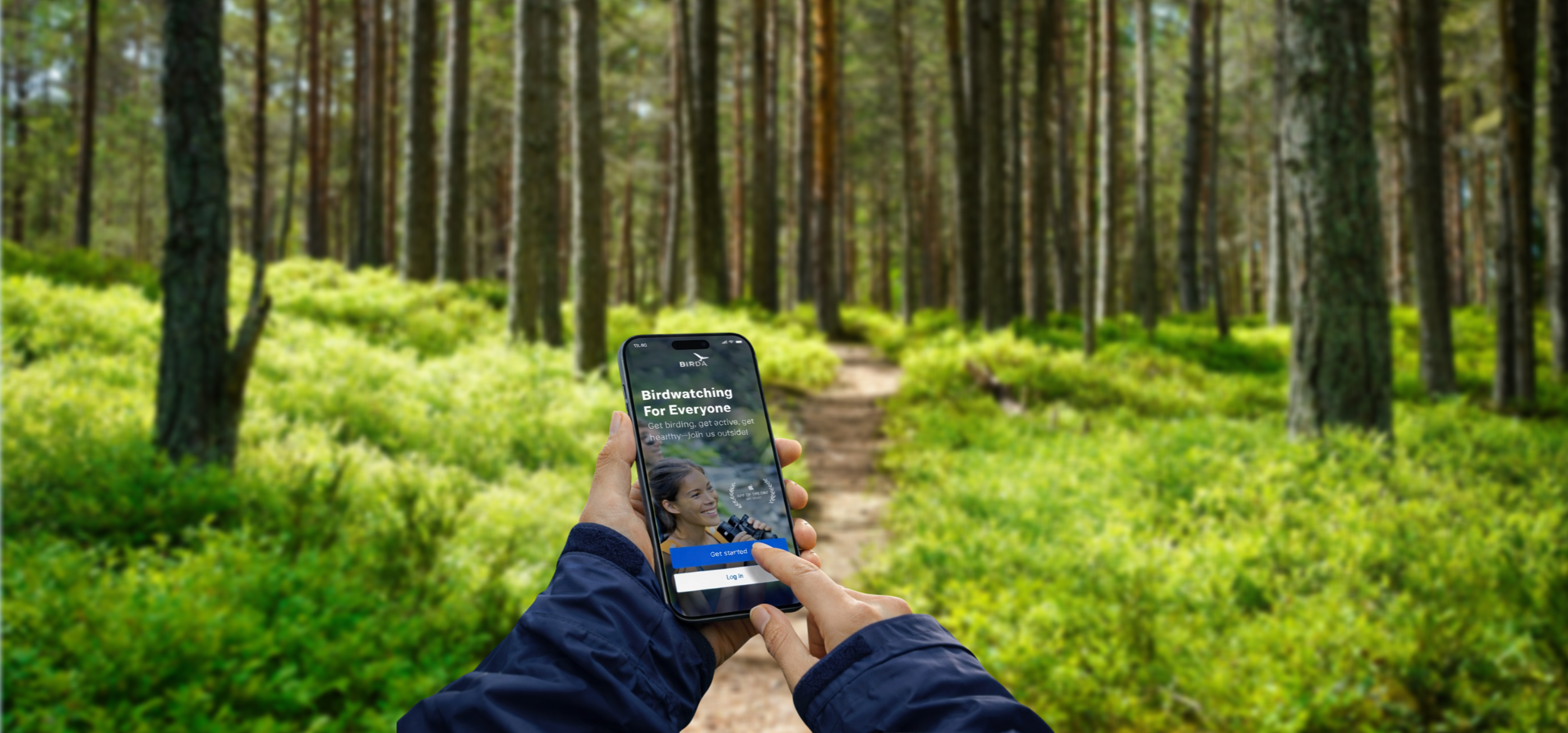
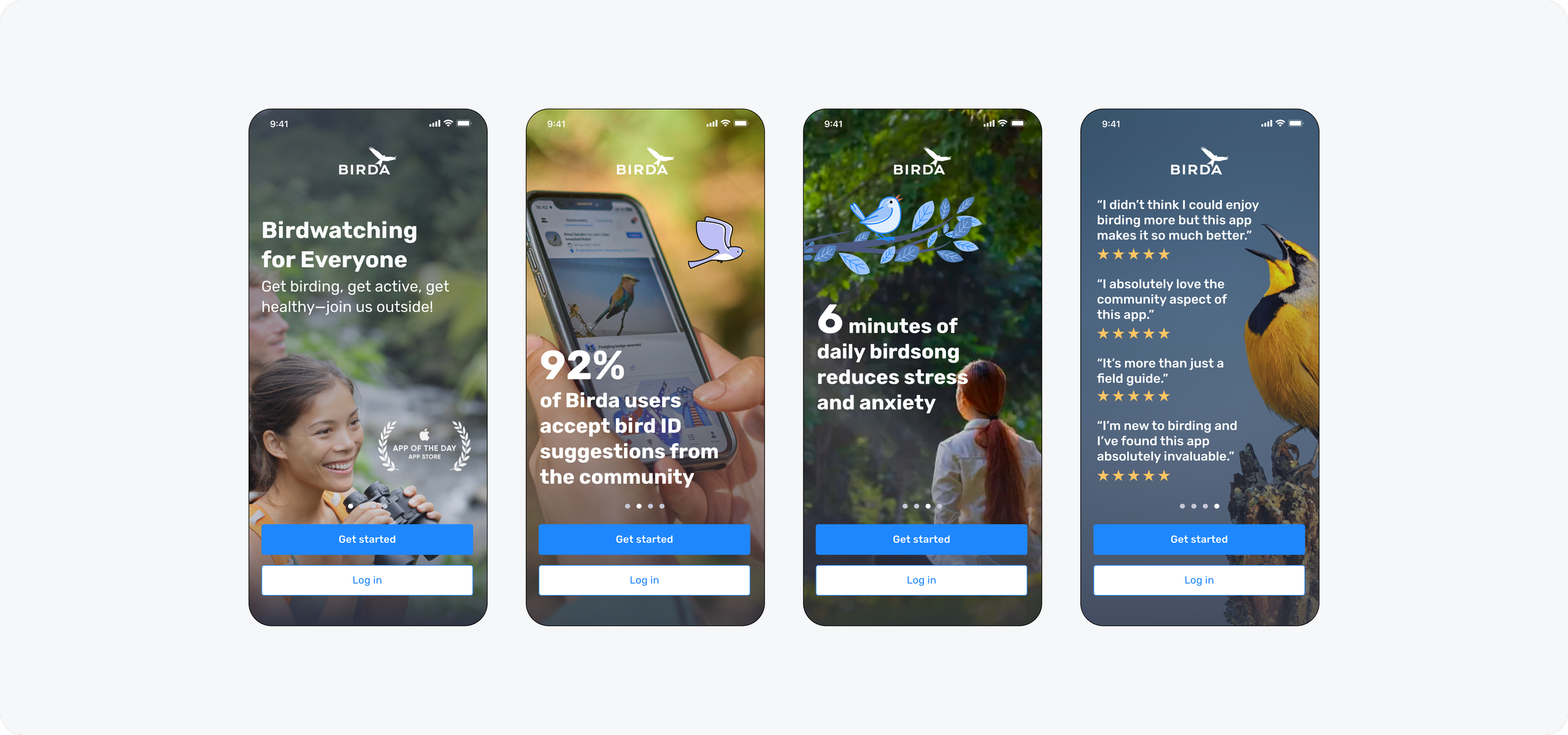
1. Engaging introduction
What it is: A short intro carousel designed to communicate Birda’s value upfront, using clear benefits and social proof before asking users to commit.
Why it matters: Sets expectations immediately and makes Birda’s value easy to understand within seconds.
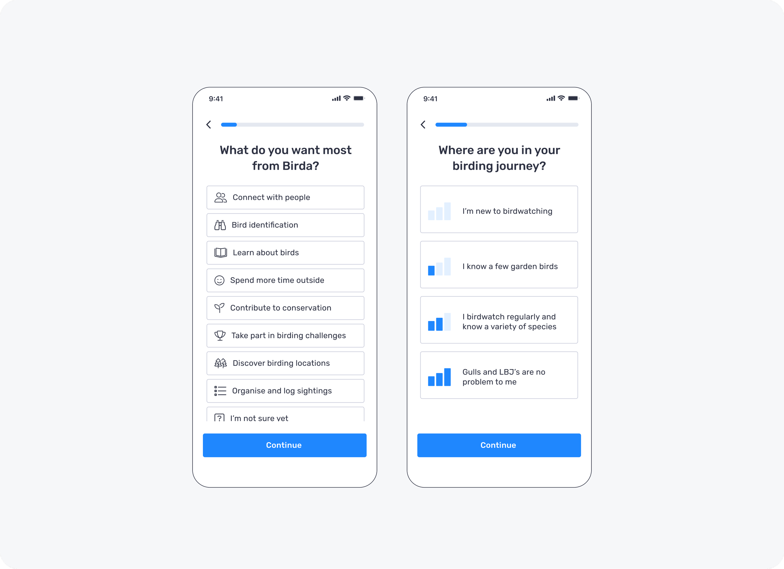
2. Segmentation and personalisation
What it is: Two quick questions that capture user intent and experience level, so Birda can personalise the first-time experience instead of giving everyone the same generic path.
Why it matters: Helps users feel understood from the start and makes the onboarding experience more relevant, which increases the chance they take a meaningful first action.
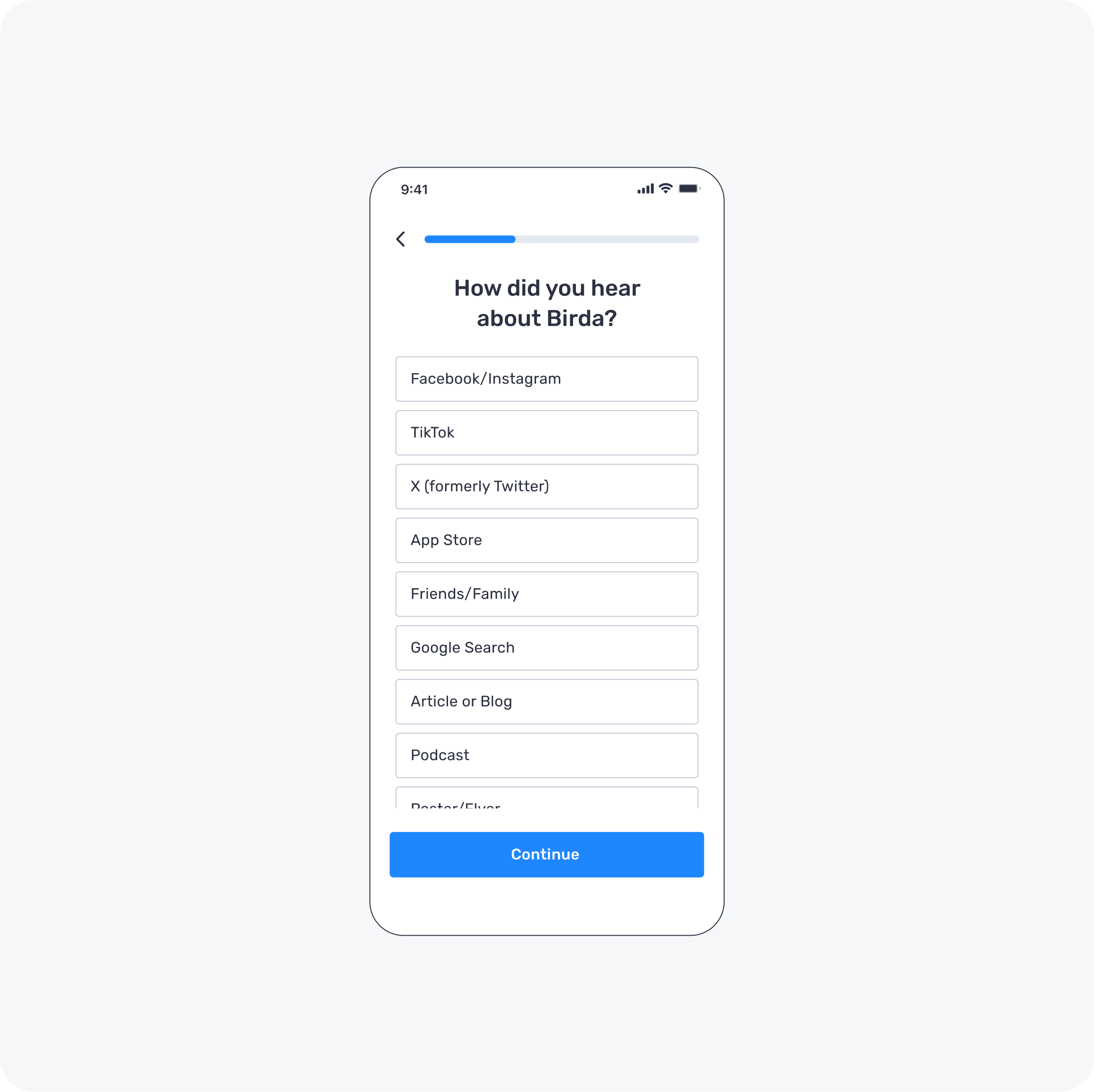
3. User acquisition insights
What it is: A lightweight question that captures where users discovered Birda, giving us early visibility into acquisition sources without adding friction to onboarding.
Why it matters: As an early-stage startup, we needed to understand which channels were driving installs so we could prioritise spend and focus on the highest-intent acquisition sources.
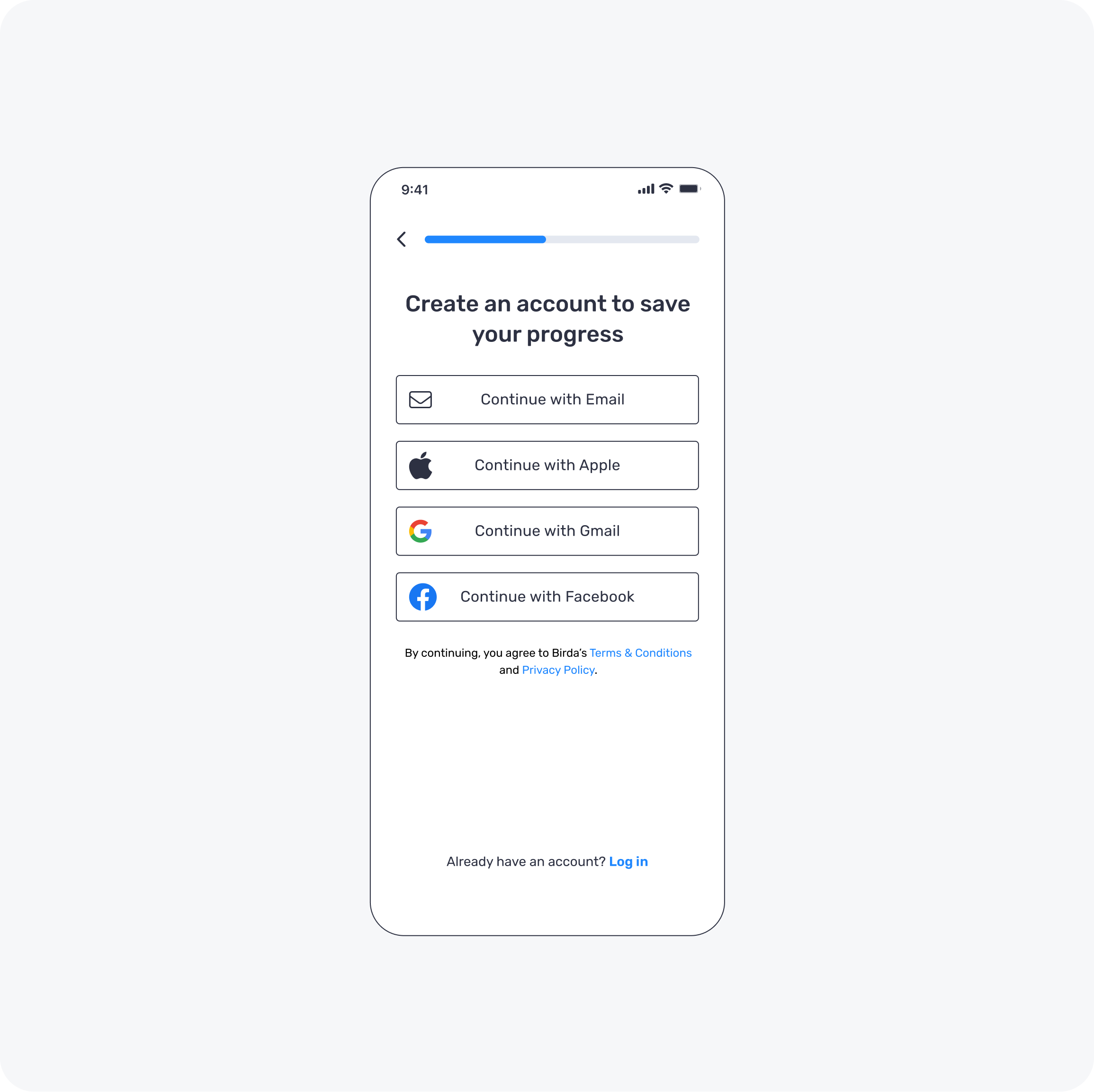
4. Structured account creation
What it is: A simplified sign up flow that asks for the minimum information needed to create an account, with clear steps and reduced friction.
Why it matters: Sign up still happens, but it comes after users understand the value and have shared their intent, so it feels like a natural next step rather than a barrier.
5. Tailored landing
What it is: A personalised landing experience that reflects the user’s intent and level, showing the most relevant content and actions straight away.
Why it matters: It turns segmentation into immediate relevance, so users understand what to do next and feel confident taking a first action.
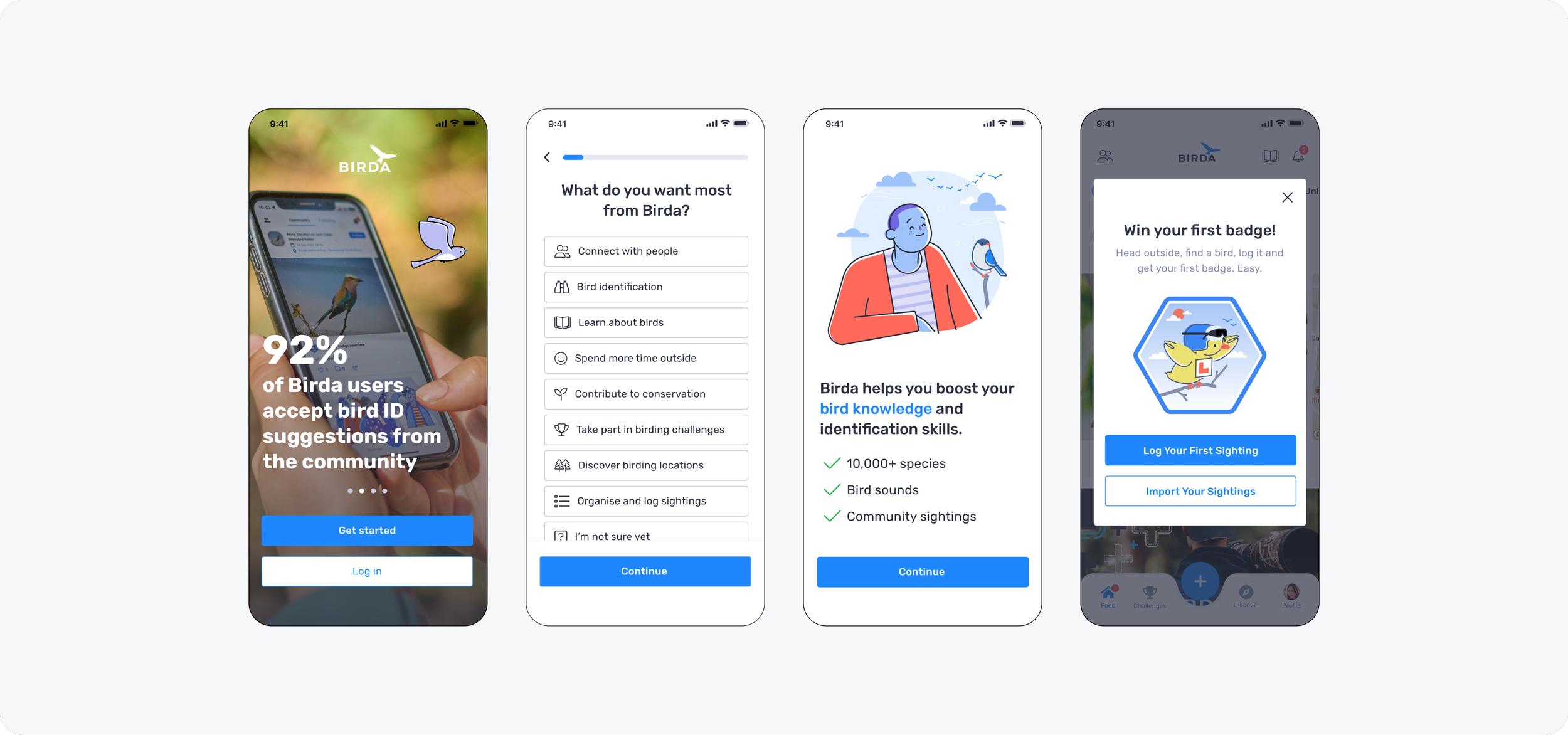
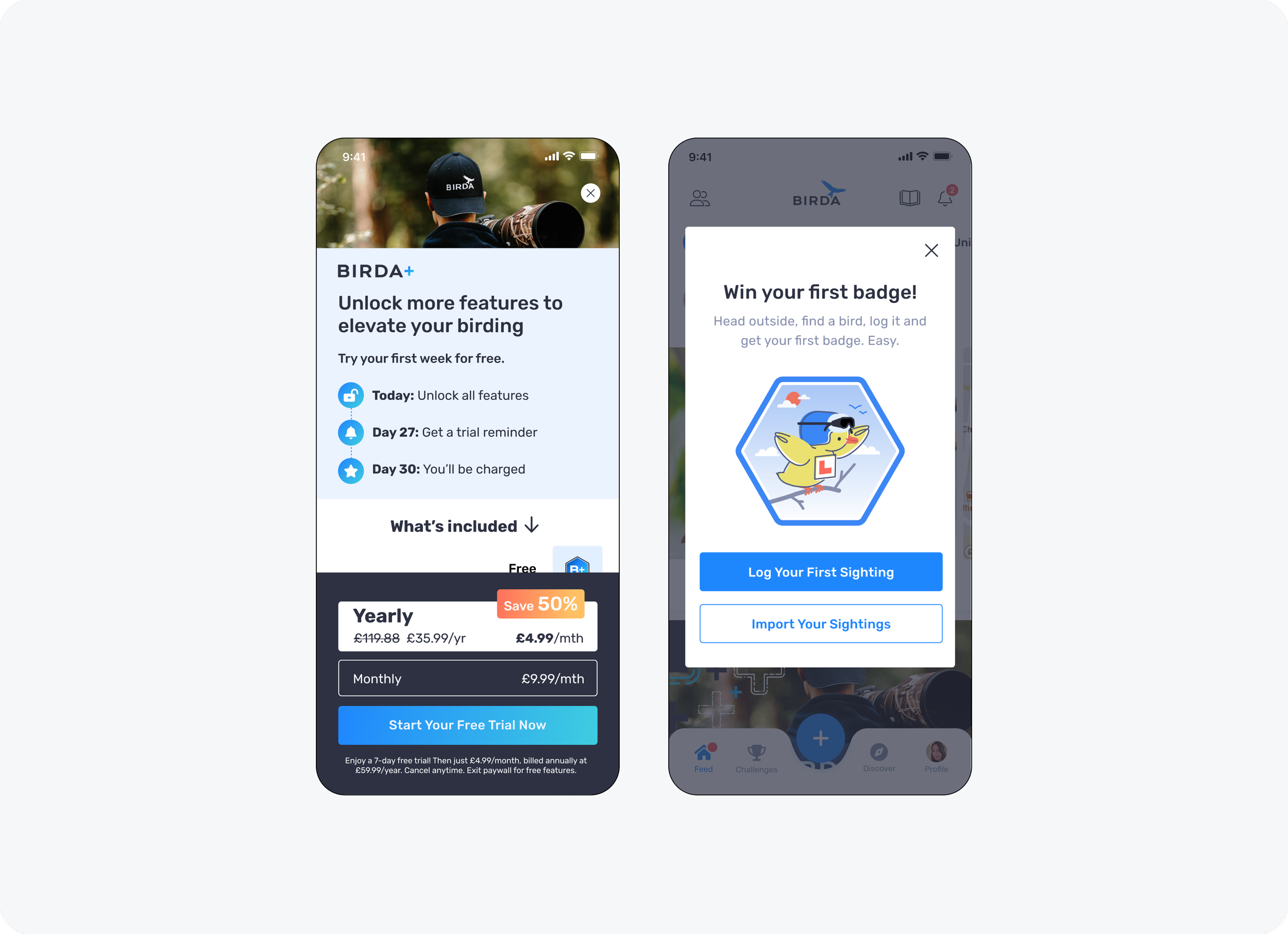
6. Engagement and conversion
What it is: The final onboarding step that introduces Birda+ in context and then guides users towards a clear first action (identify, log or explore), so the experience does not end in a dead end.
Why it matters: It connects value to conversion while still helping users take a meaningful next step, increasing the chance users engage after onboarding instead of dropping off.
How we drove first action: We used a simple “first badge” prompt to encourage immediate interaction with the product. New users could earn their first badge by either logging their first sighting or importing sightings from another app or platform, helping them build momentum and feel rewarded straight away.
Result
The redesigned onboarding created a smoother first-time experience, helping new users understand Birda more quickly and reach a meaningful first action sooner.
It also improved early engagement and sign-up completion, while giving the business clearer visibility into user intent during the first session.
Key learnings
Redesigning onboarding did more than reduce friction. It gave us a much clearer understanding of who was coming to Birda, why they were downloading the app, and what they needed in their first few minutes.
Key learnings included:
A large beginner segment: A significant proportion of users were completely new to birdwatching. They were highly motivated but needed reassurance, guidance, and a clear first step to build confidence and momentum early on.
Tools should support learning, not test knowledge: Features such as AI-powered Photo ID, sound identification, and the species guide worked best when positioned as supportive learning tools rather than accuracy tests.
Community as a confidence multiplier: The Unidentified Species feed played a key role by allowing users to share photos and ask for help, supporting beginners while enabling more experienced users to contribute and reinforce shared knowledge.
Different experience levels, one inclusive journey: Onboarding needed to support both beginners and experienced birdwatchers, without limiting depth or discovery for more advanced users.
Clearer acquisition signals: Early onboarding insights gave Marketing better visibility into where users were coming from, supporting more informed acquisition decisions.
Iteration mindset
Onboarding was never treated as a one-and-done launch. Insights from early onboarding helped inform ongoing discussions across Product, Design, and Marketing, ensuring decisions were grounded in real user behaviour rather than assumptions.
These signals supported prioritisation of the right improvements, faster iteration on key areas, and clearer alignment between value, activation, and monetisation, particularly as Birda+ evolved.
The onboarding experience continued to evolve through ongoing refinements to reduce drop-off, improve clarity, and strengthen early engagement as the product matured.
Reflection
This project reinforced that onboarding is never done. It is one of the most important growth levers in any product and requires continuous iteration, especially in a multi-purpose app where users arrive with different motivations.
Recognition
This project is one example of the wider UX/UI work delivered at Birda over the years, with a strong focus on making the product clear, approachable, and easy to use.
That emphasis on clarity and ease of use was consistently reflected in user feedback, including App Store reviews, user interviews, and messages to Customer Support. Users often described the app as user-friendly, easy to use, and intuitive, with many also highlighting the supportive and friendly community.
Alongside many other initiatives delivered over time, this work contributed to Birda being featured as App of the Day in 148 countries, reflecting the strength and quality of the overall product experience.
Throughout this period, the app maintained a 4.8 out of 5 App Store rating, with reviews frequently highlighting how simple, enjoyable, and supportive the experience felt.
