Birda Life Lists Redesign
Redesigning Life Lists to help birdwatchers clearly see their progress and feel motivated to keep going.
Project Summary
Life Lists are one of the core features in any birdwatching app, helping users track the birds they have seen and understand their progress over time. When I joined Birda, Life Lists already existed as a functional MVP needed to launch the app, but the experience was visually dense and relied heavily on long lists, making it hard to scan and engage with. This project focused on evolving the feature beyond its initial implementation, redesigning it to be clearer, more visual, and easier to understand at a glance, helping users feel more motivated and confident as they continued their birdwatching journey.
Role: Head of UX/UI
Platform: iOS app
Focus: Core feature redesign · Visual clarity · Long-term engagement
Context
Life Lists are one of the most important features in any birdwatching app. They are where birdwatchers track the species they have seen over time, reflect on their progress, and relive memorable moments. For many users, Life Lists are not just a record, but a core source of motivation to keep birdwatching.
When I joined Birda, the product had already launched on the App Store with a set of functional MVP features required to ship and support early users. These initial implementations were intentionally basic and neutral, focused on functionality rather than experience.
As soon as we started to get users, I began speaking with them and testing the app to understand how it was being used in practice. It quickly became clear that the product had strong potential, but that in order to grow, attract a wider audience, and support different levels of birding experience, the overall experience needed to feel clearer, lighter, and more enjoyable to use.
This marked the start of a broader UX and UI evolution across the app. The goal was not to simplify birdwatching itself, but to move away from the traditionally data-heavy, spreadsheet-like experiences common in birding tools, and towards something more visual, approachable, and engaging, without losing depth or credibility.
Life Lists became one of the first features where this new direction was explored. It was a natural starting point to rethink how progress, achievement, and motivation could be communicated visually, and how the experience could feel less like managing data and more like engaging with a hobby people genuinely love.
Before: the initial Life Lists experience
When I joined Birda, the Life Lists experience was visually heavy and difficult to scan. The interface relied heavily on long text-based lists, dark colours, and dense layouts, making it hard for users to quickly understand their progress or feel rewarded for their activity.
Key issues with the initial experience included:
Too much cognitive load, requiring users to read rather than scan
Limited visual hierarchy, making progress hard to grasp at a glance
A lack of visual motivation or delight, despite Life Lists being an emotional feature for birders
The feature worked, but the experience did not yet reflect how important Life Lists were to users or to the product as a whole.
First redesign: making progress visible and motivating
The first redesign focused on transforming Life Lists from a purely functional record into a clear, visual, and motivating experience.
This work did not happen in isolation. Life Lists was part of a broader UX and UI evolution across the app, alongside ongoing improvements across multiple areas of the product. The overall goal was to create a clearer, more intuitive experience that helped users understand what they could do and take action with minimal effort.
For Life Lists specifically, the user intent was very clear. People came to this screen to quickly see their progress, how many species they had seen and how many sightings they had logged, whether all time, this year, this month, or within a specific location.
My focus was on removing unnecessary cognitive load and letting the interface do the work for the user. I designed the experience so that layout, colour, icons, and visual hierarchy naturally guided attention, allowing users to understand their progress at a glance and feel oriented the moment they landed on the screen.
I redesigned the feature to make progress instantly understandable through strong visual hierarchy and clear summaries, surface the most important information first while reducing reliance on long, text heavy lists, introduce a lighter and more welcoming visual language aligned with Birda’s evolving brand, and help users quickly understand where they were and what they could do next without the need for instructions.
The intention was to create a calm, clear experience where users could scan the screen and immediately understand their progress and feel motivated to continue.
As a result, Life Lists shifted from feeling like a static database to a personal record of achievement, something users could easily return to, feel proud of, and use as motivation to keep birdwatching.
Design evolution: Before and after
1. Life Lists Home
Before
Users landed on a dense, text-heavy screen that required reading to understand their progress.
With multiple list types available (All time, This year, This month, Patch, Home), it was difficult to quickly distinguish between them, as users had to rely on reading labels rather than visual cues.
After
Clear summaries, colour-coded labels, and visual hierarchy enable quick scanning and immediate understanding.
Each list type is now visually distinct, allowing users to instantly recognise whether they are viewing all-time progress, recent activity, or a specific location. Custom illustrations further reinforce meaning and make the experience more engaging and approachable.
2. Life Lists - All Time
Before
Users were taken straight into a long, text-only list with minimal structure, making it difficult to quickly understand scale, overall progress, or where to focus.
There was also little context explaining what each list represented, meaning new users often did not fully understand the difference between All Time, This Year, or other list types.
After
Key lifetime metrics are surfaced first, providing immediate context before users explore the list. Clear grouping, spacing, and visual hierarchy make large lists easier to scan and navigate.
Each list now includes a short explanation of what it represents, helping users, especially new ones, quickly understand the meaning of each view and feel confident about where they are.
At this stage, species photos were not yet available, as the species guide was still in early development.
Second iteration: Scaling Life Lists with Birda+
As Birda evolved, Life Lists needed to scale beyond a fixed set of views and support more advanced and personalised ways of tracking progress. This second iteration was closely tied to the launch of Birda+, which introduced Custom Life Lists and enabled more flexible, location-based tracking.
This iteration focused on evolving Life Lists into a scalable system that could support premium features while remaining clear, approachable, and easy to use.
Key changes included:
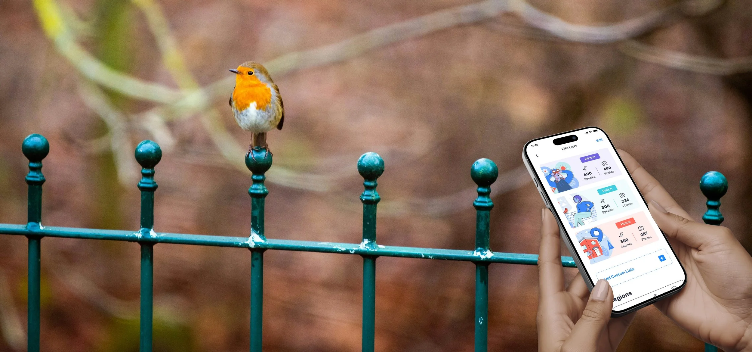
A simplified structure: Life Lists were reorganised around three core list types: Global, Patch, and Home, reducing duplication and making the overall system easier to understand.
Time-based filters instead of separate screens: Rather than treating each list as a separate destination, users could switch between All Time, This Year, This Month, and previous years using filters within the same view. This reduced repetition and made it easier to compare progress over time.
Custom Life Lists powered by Birda+: With Birda+, users could add Custom Life Lists automatically generated from their sightings, organised by regions and countries they had visited. These lists required no manual setup and updated automatically as new sightings were logged, reinforcing a sense of effortless progress tracking.
Introduction of species imagery: As the species guide matured, Life Lists began to include species photos. When users had photographed a species themselves, their own image was shown. If not, the guide image was used instead. This preserved visual consistency while subtly rewarding users without blocking progress.
Stronger connection between progress and place: For location-based lists, visual cues helped users associate their sightings with real-world locations, reinforcing Life Lists as a record of experiences rather than just data.
Overall, this iteration transformed Life Lists from a set of predefined views into a flexible, scalable system that could grow with the product and support increasingly diverse user needs.
This iteration focused less on visual comparison and more on how Life Lists evolved into a flexible, scalable system that could grow with the product and support premium use cases.
Outcome
The Life Lists redesign became one of the most visited and frequently used areas of the app. Usage patterns and qualitative feedback showed that it played a central role in how users tracked progress and returned to Birda over time.
Key outcomes included:
High engagement and repeat usage: Life Lists consistently appeared as one of the most visited areas of the app, acting as a natural return point for users checking their progress.
Strong positive user feedback: Users frequently described Life Lists as one of their favourite features, highlighting how clear, visual, and motivating the experience felt compared to more traditional birdwatching tools. This feedback surfaced across App Store reviews, user interviews, and Customer Support messages.
Clearer progress for all experience levels: The redesigned structure and visual hierarchy helped users quickly understand where they were and how they were progressing, without explanation. This supported beginners while still meeting the expectations of more experienced birdwatchers who valued depth and accuracy.
Meaningful value for Birda+ subscribers: The introduction of Custom Life Lists through Birda+ enabled more advanced, personalised ways of tracking progress. For highly active users, especially those identifying large numbers of species across different locations, this flexibility became a compelling reason to subscribe, while remaining closely aligned with the core experience.
Beyond Life Lists
Beyond the feature itself, this project marked the starting point for a broader end to end redesign of the Birda app. Life Lists was the first area where the new visual direction was introduced, including a lighter colour palette, custom illustrations, and a more expressive, approachable UI.
The design principles explored here, clarity through scanning, visual hierarchy, and motivation through progress, went on to influence multiple areas of the product and helped define Birda’s evolving visual identity.
Together with many other initiatives delivered over time, this work contributed to Birda being featured as App of the Day on the App Store in 148 countries.
User feedback
User feedback over time consistently highlighted how intuitive, enjoyable, and motivating the overall experience felt, as well as the sense of progress, discovery, and connection created across the app.
Users frequently described Birda as easy to use, rewarding to return to, and enjoyable both for quick interactions and longer birding sessions, regardless of their level of experience.
Selected user reviews:
“The Life Lists feature is brilliant. It makes tracking your progress genuinely fun and keeps you motivated to keep going.”
“It’s easy to use and it’s fun to log the birds you notice on a walk or just in your garden.”
“It’s like Pokémon Go for birding, but in real life.”
“The photo ID is surprisingly accurate and really helps when you’re not sure what you’ve seen.”
“It really encourages you to log your sightings and makes you want to come back.”
“The community is friendly and helpful, especially if you’re new to birding.”
“Birda has gently encouraged me to switch off and completely immerse myself in nature.”
“It’s become an easy addition to going out for a walk and has made me more mindful of what’s going on around me.”
“Brilliant for new or experienced birders, young or old.”