Designing a more
human
banking
onboarding
A future-facing onboarding vision for Openbank, designed to make a complex, regulated journey feel clearer, more supportive and more human.
Openbank was launching as a fully digital bank with no physical branches, making onboarding the entire first impression of the product. Existing flows were long, form-heavy, and hard to complete. I led the discovery and co-design phase to define a future onboarding vision grounded in real user needs, working across London and Madrid to shape an experience that felt clearer, more supportive, and more human, while still meeting strict banking and compliance requirements.
When there are no branches, onboarding is everything
Digital banking onboarding is one of the most demanding moments in any customer journey. Users are asked to share sensitive personal information, complete identity checks, and make financial decisions quickly, often without feeling confident or fully supported.
For Openbank, this challenge was amplified. As a fully digital bank with no physical branches, there was no in person fallback. Onboarding was not just a setup step. It was the entire first impression of the product. But across the wider banking group, onboarding flows were widely seen as too long, too form heavy, and too hard to complete.
Users complained about too many questions and unclear steps, without knowing how long the process would take.
Many users had to pause mid way through. When they returned, they felt lost and unsure where they had left off.
The experience felt transactional and form heavy, the opposite of the modern, human experience Openbank wanted to offer.
“In onboarding, reducing friction is not only about removing steps. Often, it is about reducing uncertainty.”
What we were designing for
The goal was not to redesign the existing flow. It was to define what good onboarding should feel like in a fully digital bank and build a shared vision the wider product team could design and test against.
- Understand what users need to feel confident and supported during onboarding
- Define a future vision grounded in real user needs, not internal assumptions
- Balance compliance requirements with a more human, modern experience
- A validated onboarding vision teams can reference and build from
- Clear principles for what reassuring and clear looks like in practice
- Aligned stakeholders across London and Madrid around a shared direction
- A foundation for further UX design, testing and iteration
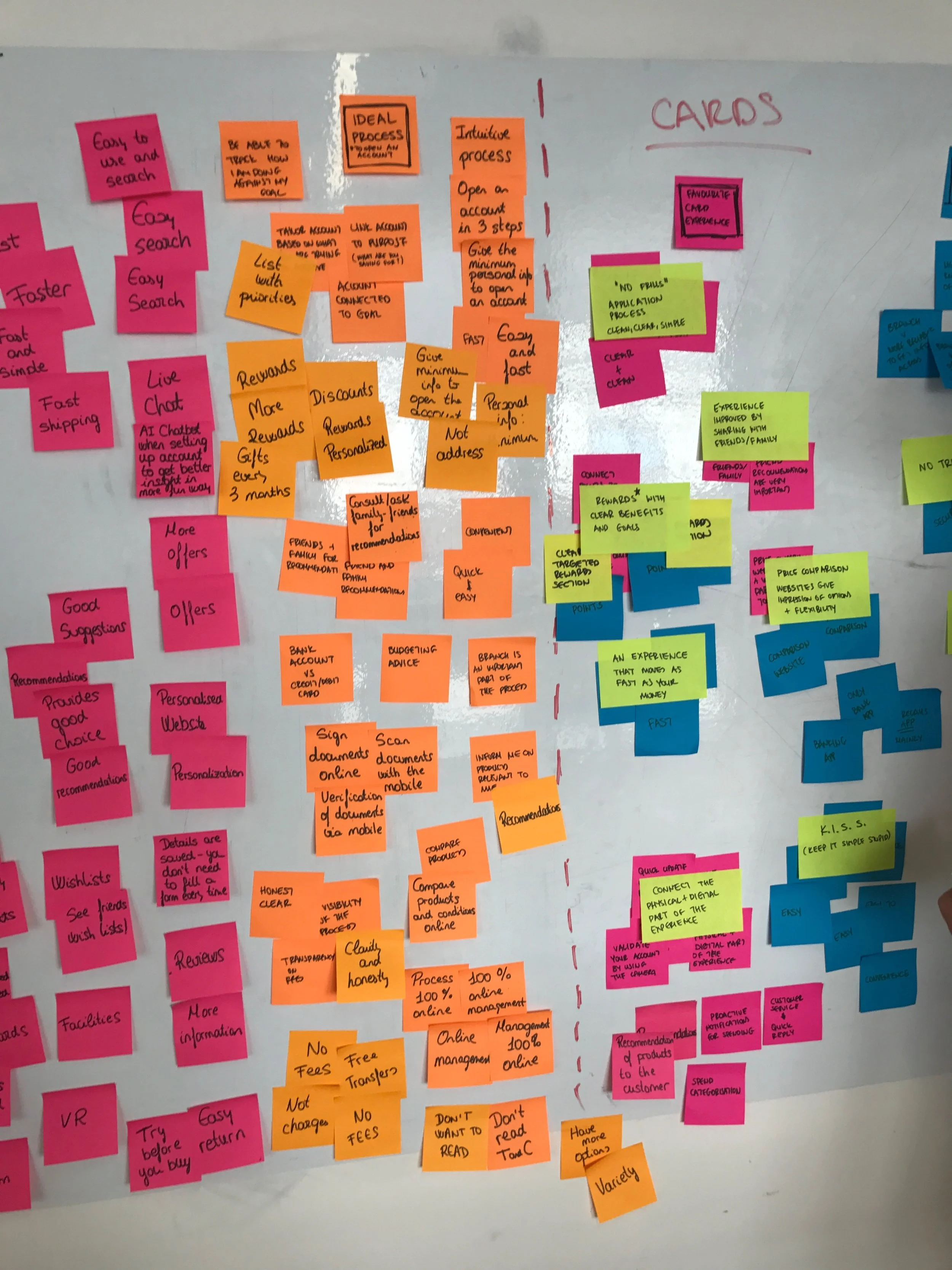
What users were telling us
Across user interviews and co design workshops, the same themes kept surfacing. Users were not just frustrated by the length of onboarding, they were anxious about it. They wanted to understand what was happening, why information was being requested, and what would come next.
I want to open an account as easily as I sign up for LinkedIn. Why does a bank need to be harder than that?
I didn't know how long it would take. I just wanted someone to tell me what step I was on.
I wasn't sure why they needed that information. I would have felt better if they'd just explained it.
I had to stop halfway through. When I came back, I didn't know where I was.
Some of the banking terms were confusing. I just wanted plain language.
Discovery-led, co-design driven
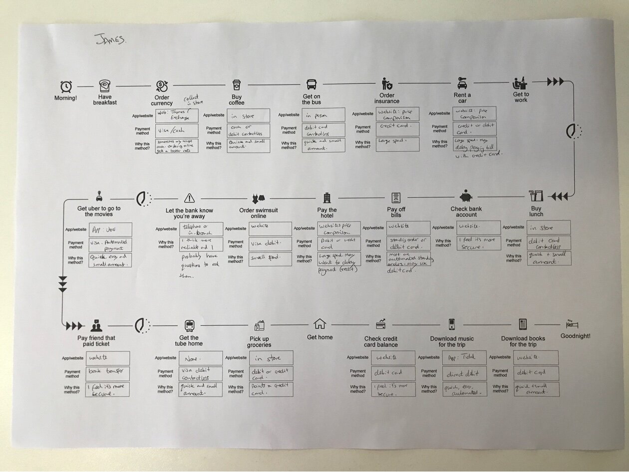
This project was highly research-driven and focused on understanding onboarding as an end-to-end service, not just a single screen flow. I worked across London and Madrid, collaborating with users and cross-functional stakeholders throughout.
User interviews Understanding expectations, anxieties and decision-making during onboarding, including the emotional moments that created friction.
Co-design workshops Three-hour sessions exploring what clarity, trust and reassurance look like in practice, with real users shaping the vision.
Benchmarking and competitive analysis Research across digital banking and adjacent industries to identify best practices and opportunities.
Persona development Capturing key behaviours, motivations and confidence levels across different user types.
Journey mapping Identifying friction points and emotional drop-off moments across the full onboarding service.
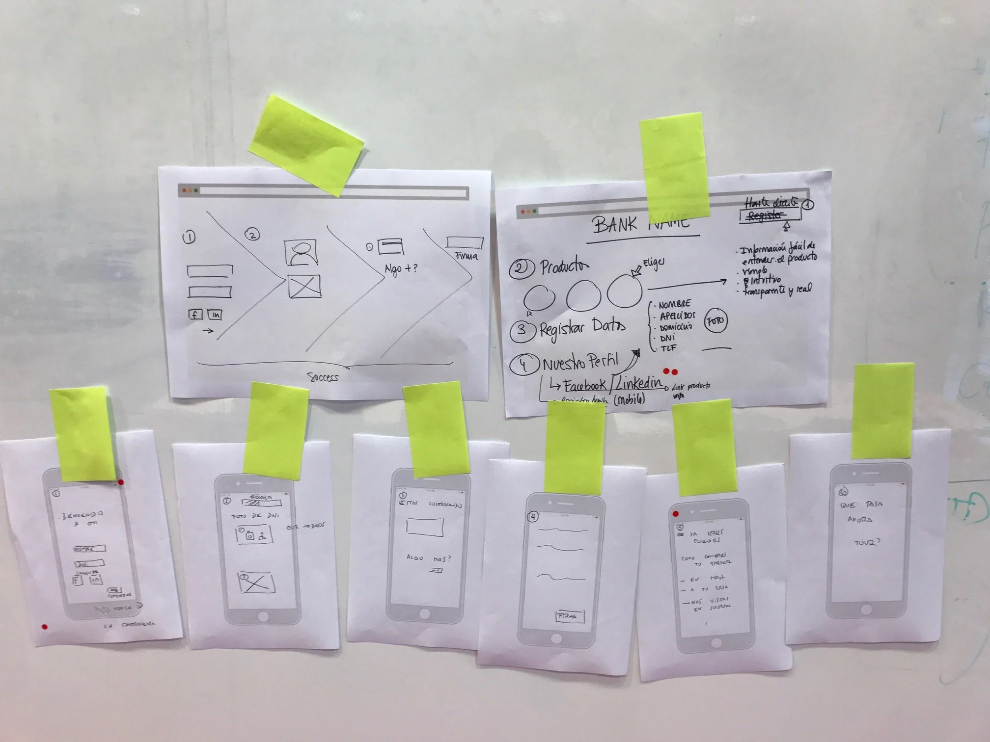
Iterative wireframing Translating insights into flows and interface concepts, tested and refined before progressing to a defined vision.
Building the vision with users, not just for them
The co-design workshops were central to this project. Rather than presenting solutions, we invited users to help us define what "good onboarding" should feel like, exploring concepts around clarity, guidance, trust, and reassurance in a regulated context.

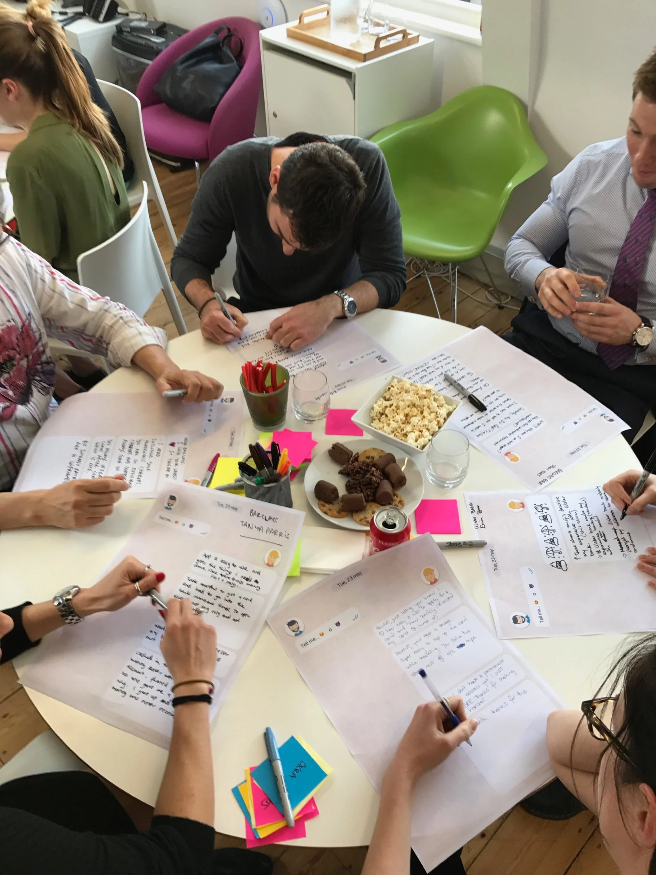
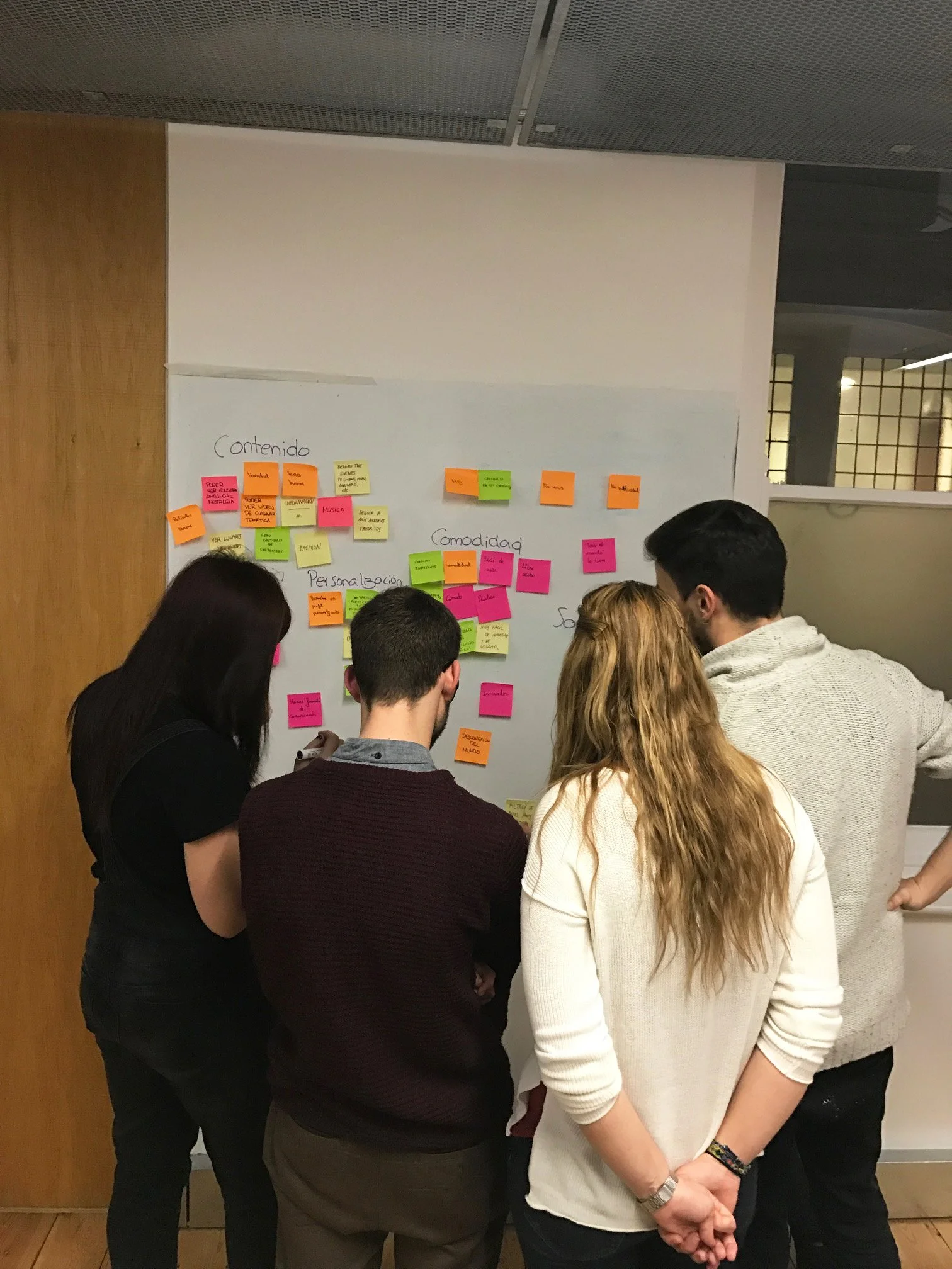


Co-design workshops across London and Madrid, users helped define what "good onboarding" should feel like
Five themes that shaped the vision
Across interviews and workshops, consistent themes emerged that reframed how we thought about the problem. The friction wasn't always in the longest steps, it was in the moments of uncertainty.
Speed matters, but not at the expense of confidence
Users were happy to move quickly, but only when the process felt structured, predictable and clearly explained. Uncertainty slowed them down more than effort did.
Trust is built through clarity and transparency
Users needed to understand what was happening, why information was being requested and what would come next. Without that, anxiety increased at every step.
Uncertainty creates friction more than effort does
The moments that slowed people down were rarely the longest steps. They were the ones where users felt unsure or lacked context about what they were doing and why.
A guided experience reduces anxiety
Users responded positively to onboarding that felt supportive and conversational rather than form-heavy and transactional. Being guided made the process feel manageable.
Users wanted social-level simplicity and plain language
The strongest theme was that users wanted to open a bank account as easily as signing up for LinkedIn. They wanted simple language, optional guidance and support available whenever they needed it.
From research to a future-facing vision
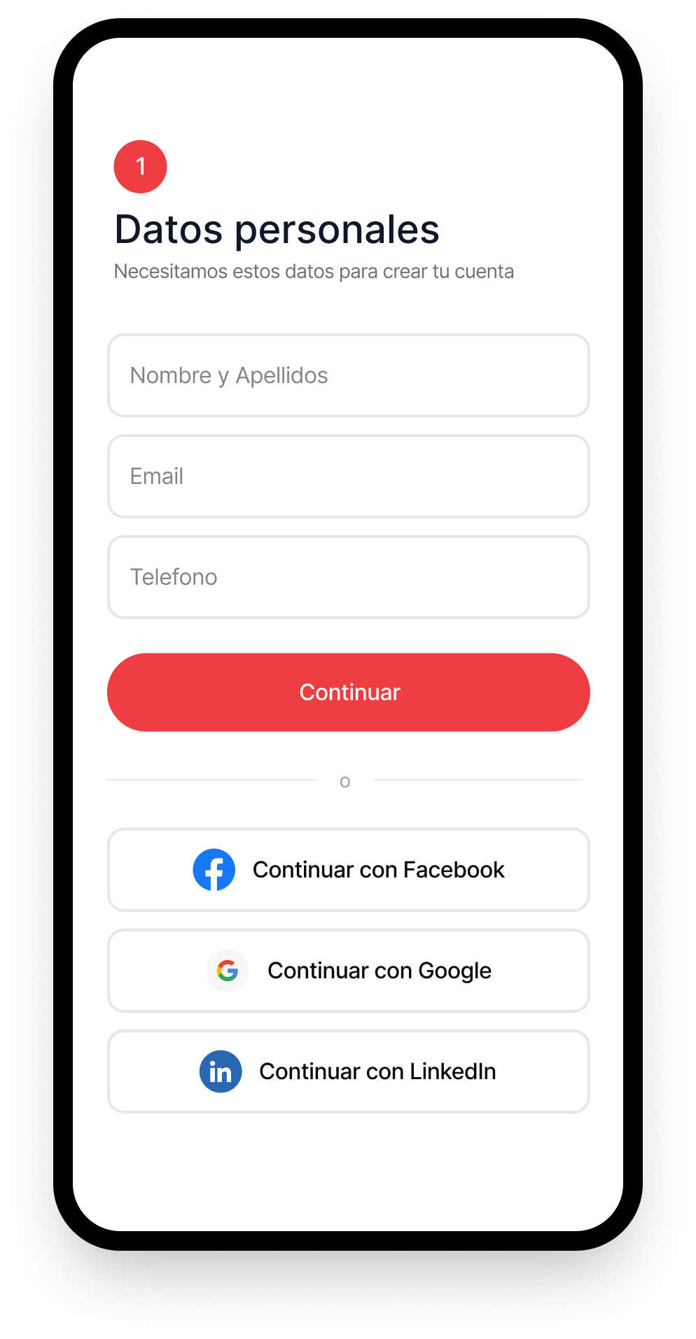
I translated research insights into end-to-end onboarding journeys, mapping key steps, edge cases, emotional states and decision points across the full service. A core principle behind the concept was designing onboarding to feel as easy and familiar as signing up for a social platform, while still meeting strict banking and compliance requirements.
Rather than treating onboarding as a one-off form flow, we explored how it could feel like a guided service, with continuous support available whenever users felt uncertain or needed help.

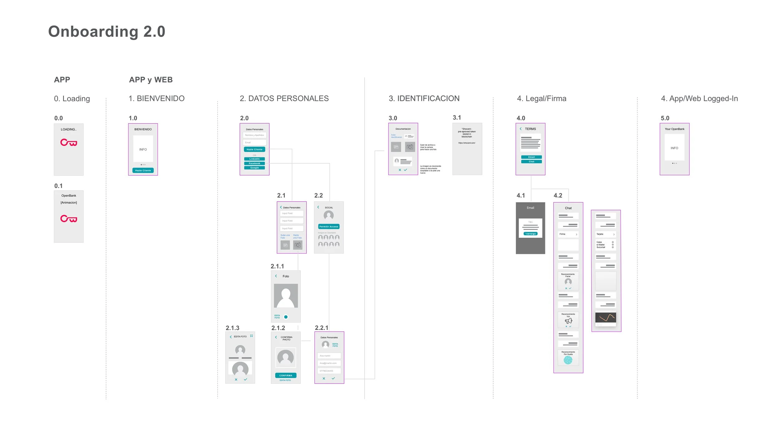
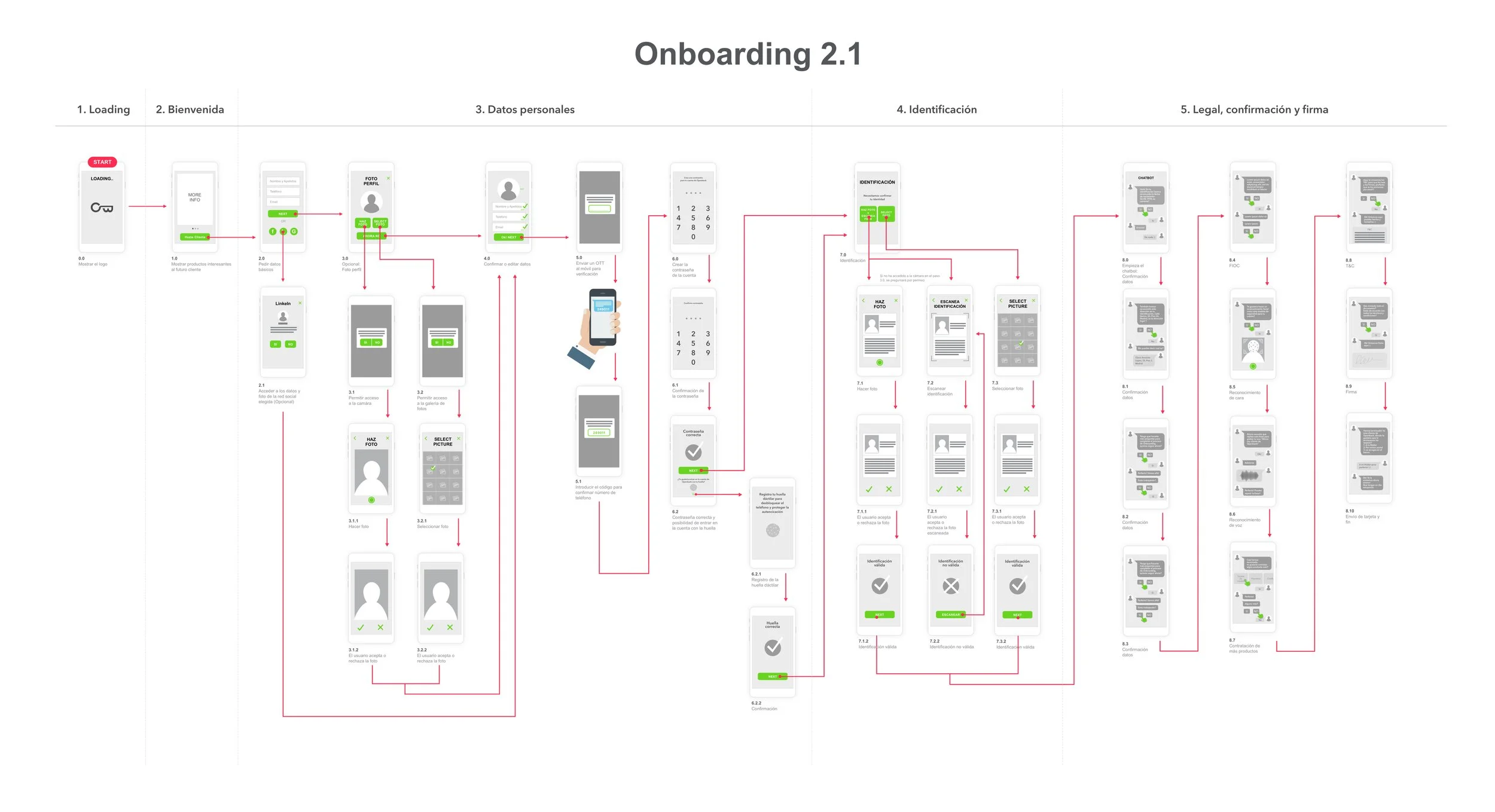
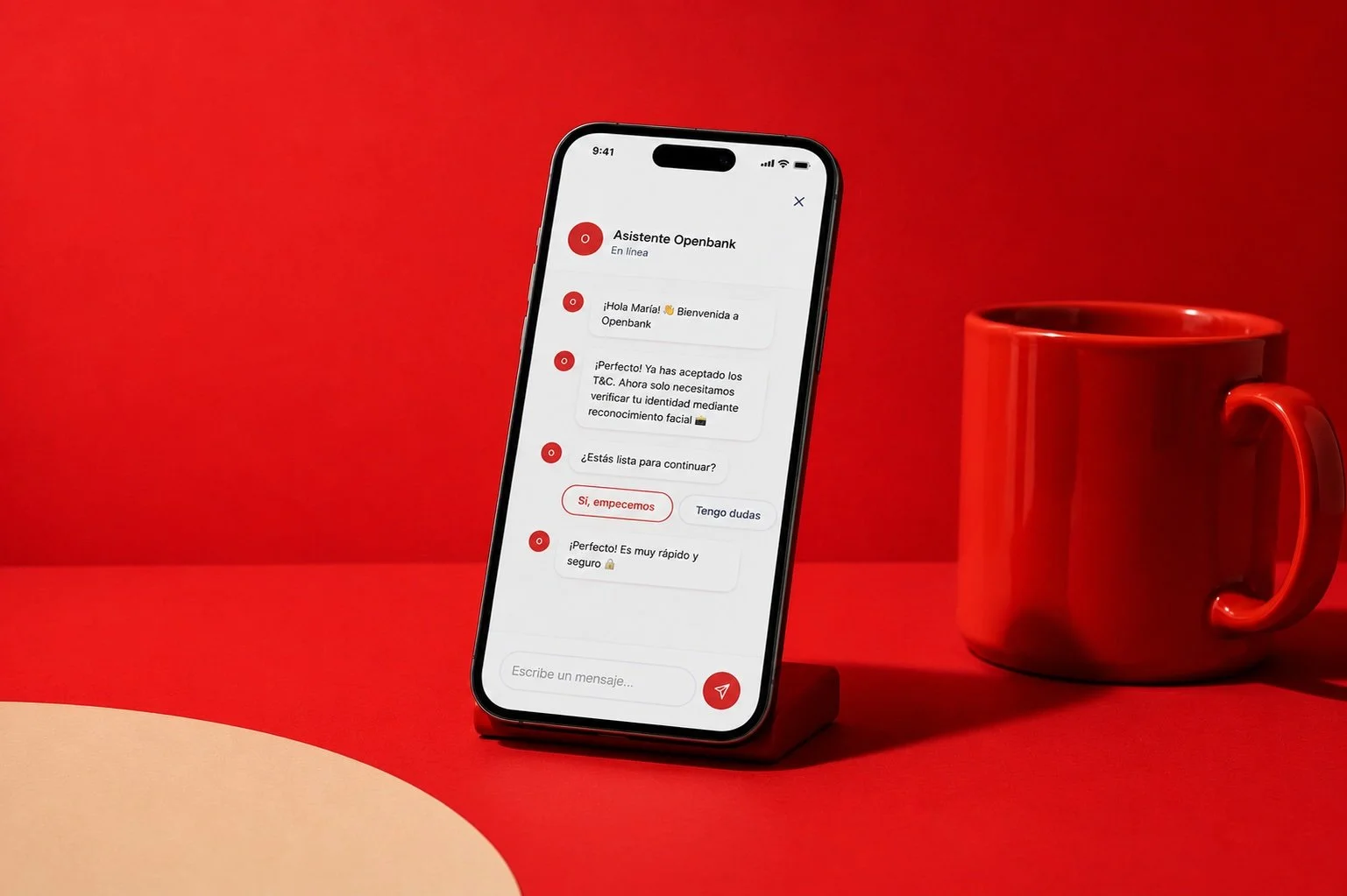
A guided, human onboarding experience
The final concept introduced a more guided onboarding experience designed to help users feel supported through a traditionally complex process. We explored multiple iterations, refining the experience to reduce friction and hesitation, improve clarity at key moments, and keep compliance and identity requirements fully intact.
Clearer step-by-step structure
Users could see exactly where they were in the process and what was coming next, removing the anxiety of not knowing how long onboarding would take.
Reassurance at key decision moments
At every moment where users needed to share sensitive information, we added clear explanations of why it was needed and what would happen with it.
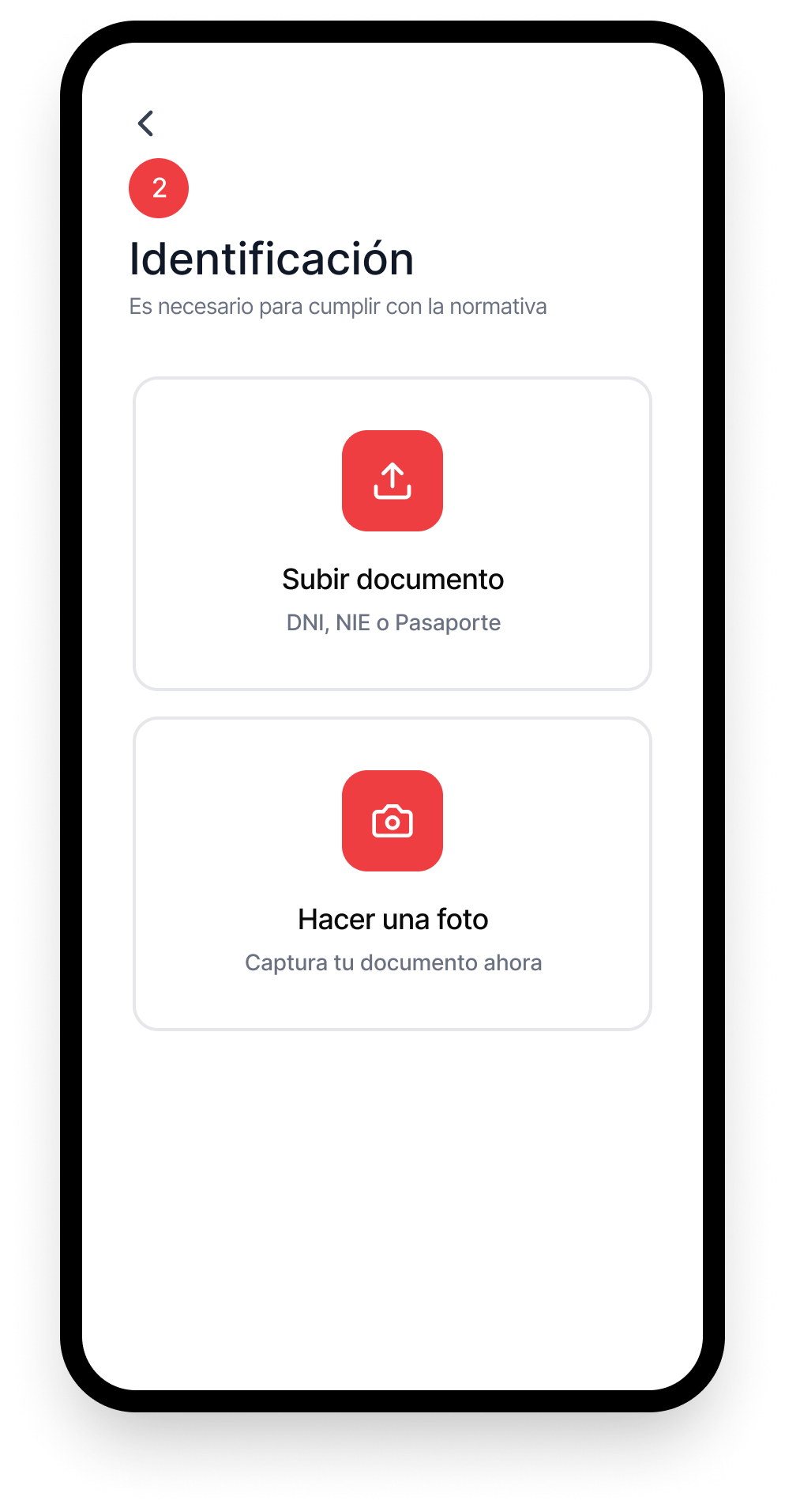
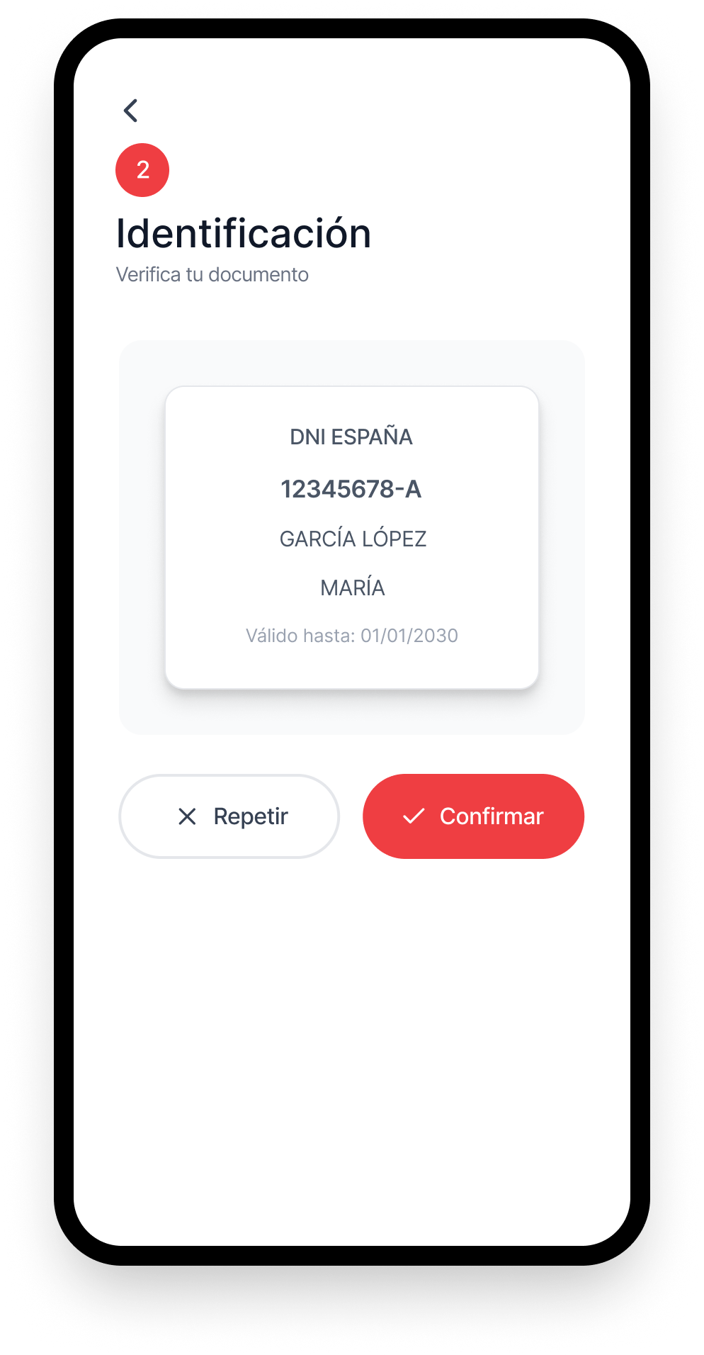
Smoother identity verification
The most friction-heavy part of banking onboarding was redesigned to feel less like an interrogation and more like a supported, step-by-step process.
brand entry
point
+ social login
intro
verification

conditions
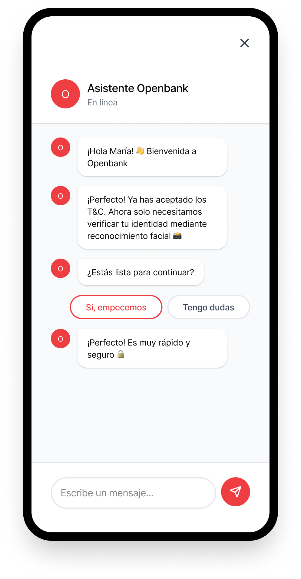
assistant
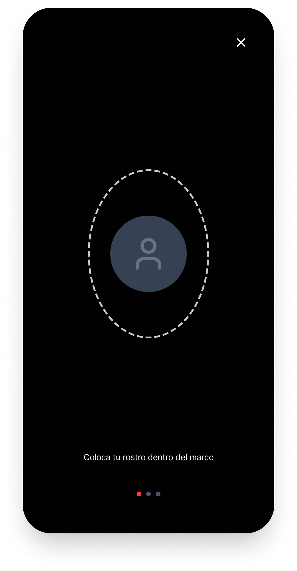
recognition
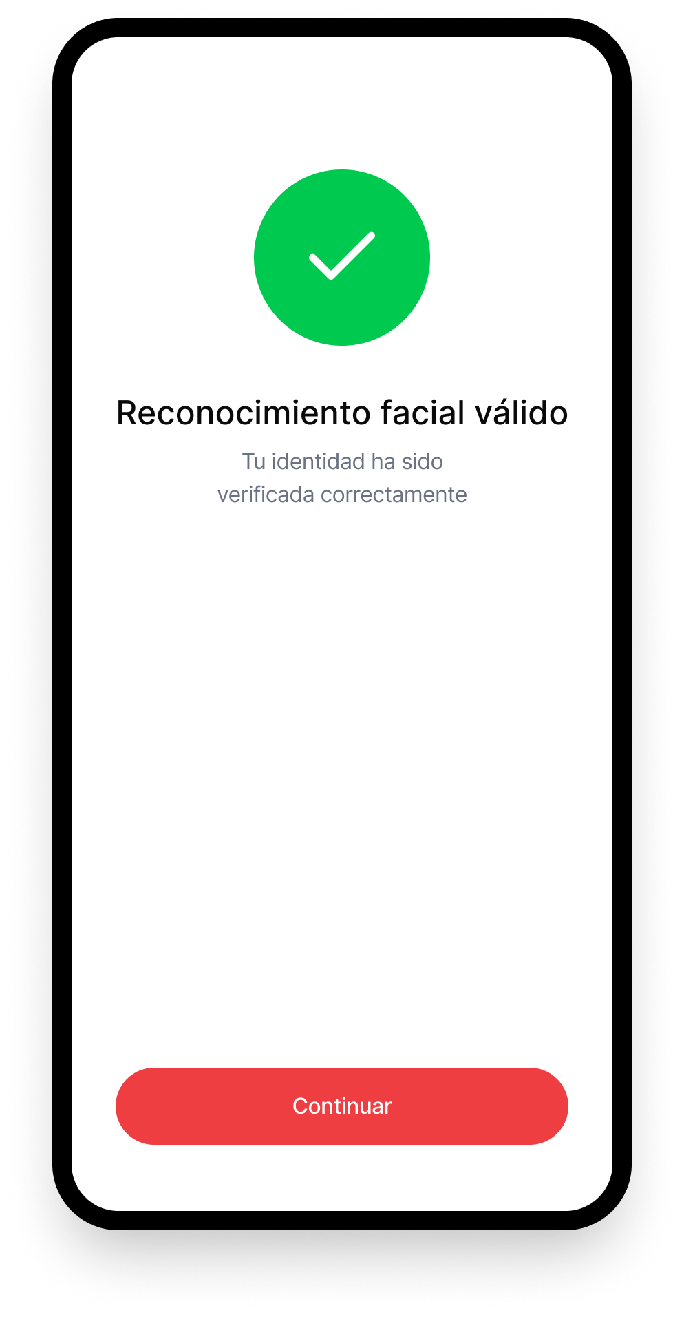
confirmed
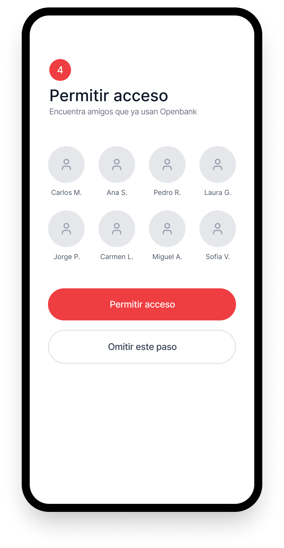
with friends
Ten key moments in the final onboarding flow, from splash through to account activation
brand entry
point
+ social login
intro
verification
conditions
assistant
recognition
confirmed
with friends
A validated vision teams could build from
This project delivered a validated onboarding vision that Openbank could use as a reference point for future product development. It helped align internal teams around where friction and uncertainty appear, what reassuring and clear onboarding looks like in practice, and how to balance compliance with a more human experience.
Uncertainty is the real friction: The moments that stopped users were not always the longest steps. They were the ones where users felt unsure about what was happening and why. Clarity matters more than brevity.
Compliance and humanity are not opposites: With the right framing, reassuring language and step-by-step guidance, it is possible to meet strict banking requirements without the experience feeling cold or transactional.
Co-design builds better alignment: Involving users in shaping the vision, not just validating it, produced richer insights and gave stakeholders confidence that the direction was grounded in real behaviour.
Cross-market discovery adds depth: Working across London and Madrid revealed how expectations and anxieties varied by context, producing a more robust and adaptable vision than a single market study would have.
What this project taught me
This project reinforced how powerful discovery and co-design can be when approaching complex service journeys. Instead of jumping straight into interface solutions, we built confidence through real user input, testing assumptions early and shaping a future vision that felt both ambitious and grounded in reality.
It was also a strong reminder that in onboarding, reducing friction is not only about removing steps. Often, it is about reducing uncertainty. Users can tolerate a longer process, but they struggle when they do not know where they are, why information is being requested, or what happens next.
That insight has stayed with me across every onboarding project since.
Users can tolerate a longer process. What they cannot tolerate is not knowing where they are