Designing
joy into
every send
I designed the end-to-end creation experience for Thortful’s new postcard product, helping users create something personal, playful and fast without feeling overwhelmed by choice.
I designed the end-to-end postcard creation flow for Thortful as part of a new product launch. Unlike the rest of the catalogue, postcards required a more visual, hands-on creation experience, where users could personalise quickly while keeping the flow fast, simple, and enjoyable. The challenge was balancing creative flexibility with simplicity, supporting a quick MVP launch and real user testing while staying fully aligned with Thortful's brand and visual language.
A new product type in a growing catalogue
As Thortful grew rapidly, the team began exploring new product types that could expand the catalogue while staying true to the brand's playful and personal nature. Postcards emerged as one of these opportunities.
Unlike traditional greeting cards, which follow a largely sequential flow of choosing a design, writing a message and sending it, postcards required something different. The image became the message. Users were no longer just selecting a product, they were creating it.
This introduced a fundamentally different design challenge. The experience needed to feel creative and lightweight while still providing enough guidance for users to confidently design and send a personalised postcard.
This was a true 0 to 1 project. There was no existing pattern to iterate on, no previous product within Thortful to learn from, and no established mental model inside the platform. Everything, from the creation flow and editing tools to the overall user journey, needed to be designed and validated from scratch.
Fast, joyful personalisation ready to ship
The goal was clear from the start: design and launch a postcard creation experience that felt fast and enjoyable, with low cognitive load despite multiple customisation options, and a product ready to test with real users quickly.
A creation flow that feels fast, intuitive and playful, where personalisation adds delight rather than friction, and the next step is always obvious.
A new format that extends Thortful's catalogue meaningfully, staying fully aligned with the brand's visual language and quality bar from day one.
A shippable MVP that could be tested with real users quickly, generating signal to validate the concept and inform the next iteration with confidence.
From blank page to defined structure
Before moving into visual design, I explored the postcard creation experience through early sketches, co-design sessions with users and the team, and flow mapping. The goal at this stage was not to produce finished designs. It was to define the overall structure of the experience, identify the key decision points in the journey, and stress-test assumptions before committing to a direction.
Co-design sessions brought in perspectives from both potential users and internal stakeholders. Sketching together helped surface different mental models quickly, what users expected personalisation to feel like, where they naturally wanted control, and where they wanted the app to lead.

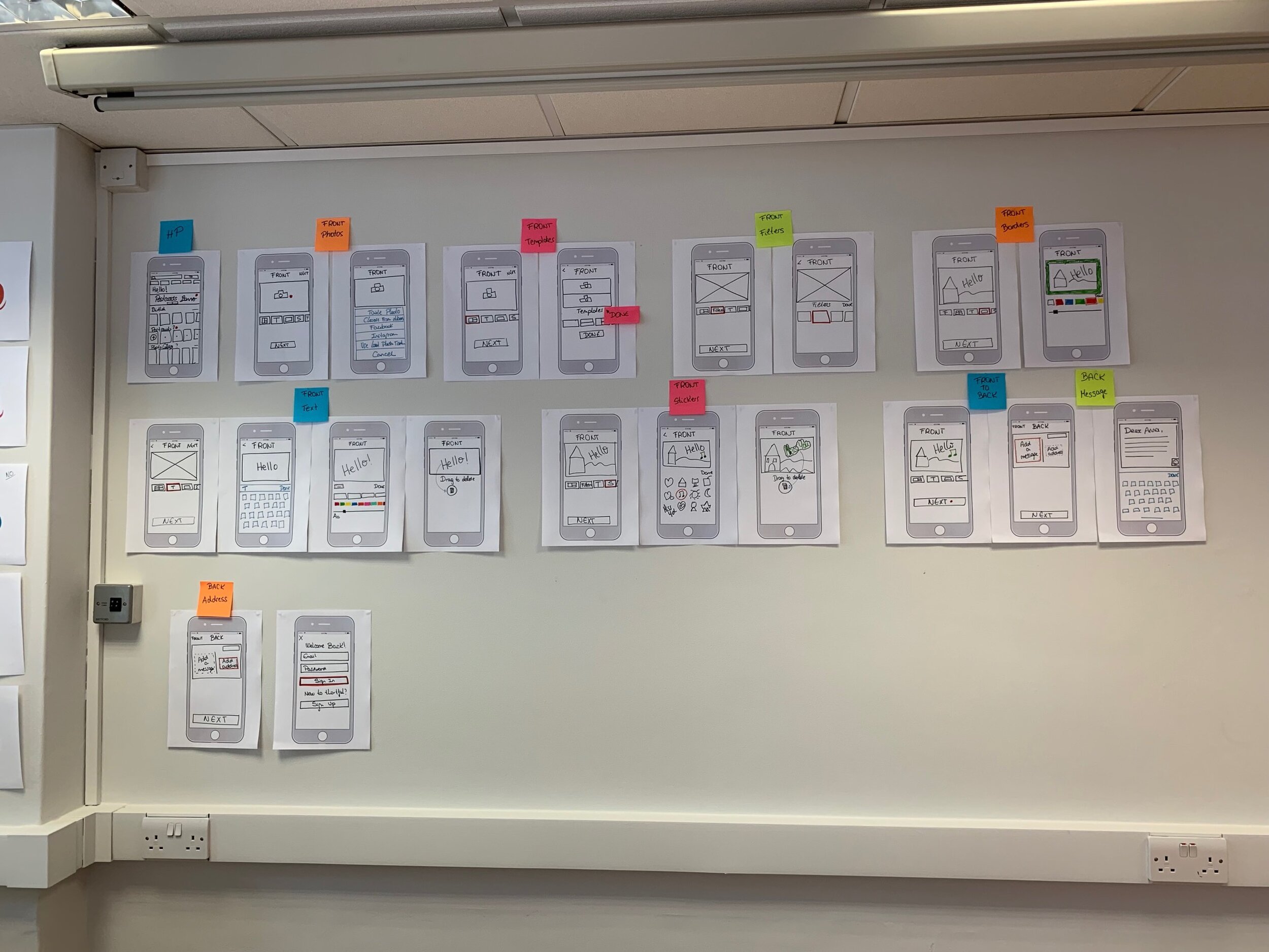
This phase surfaced three things that shaped everything that followed: users wanted to feel like they were creating something, not filling out a form; the order of personalisation steps mattered enormously for perceived effort; and the tools needed to feel discoverable rather than comprehensive.
Creativity without complexity
The central tension in designing a postcard creation flow is that the things that make personalisation feel rich, choice of image, text, borders, stickers, filters, are precisely the things that can make a flow feel heavy and slow. Every additional option is a potential source of hesitation.
- Exposing all personalisation tools at once creates decision paralysis before the user has started
- Without structure, users lose track of how far through the flow they are
- A tool heavy interface starts to feel more like work than creative expression
- A minimal flow feels generic, users will not feel the postcard is truly theirs
- Low creative investment reduces the perceived value of sending the postcard at all
- A stripped back experience misses the opportunity to make Thortful Postcards genuinely memorable
"The challenge wasn't adding features, it was sequencing them so each one felt like an invitation, not an obstacle."
Five principles that shaped every decision
The exploration phase made clear that the experience would live or die by its sequencing. These five principles were established before any screen was designed, and every subsequent decision, from the order of steps to the way tools were introduced, was filtered through them.
Create ownership early
Start with image selection. The moment users choose a photo, the postcard becomes theirs. Establishing that sense of ownership at the very first step changes how they relate to every decision that follows.
Structure without constraint
Provide light structure through templates, enough to give users a starting point and prevent blank canvas paralysis, without limiting creative expression or making the result feel pre-made.
Instant preview, instant feedback
Keep visual adjustments fast and immediately previewable. Users should be able to see the impact of every change in real time, so exploration feels rewarding rather than effortful.
Progressive personalisation
Introduce tools gradually rather than all at once. Each step in the flow surfaces one layer of personalisation, text, then borders, then stickers, then filters, keeping users focused and building momentum as they go.
The next step is always clear
At every point in the flow, the path forward must be unambiguous. Users should never have to work out what to do next, they should simply feel ready to continue.
A creation experience built for momentum
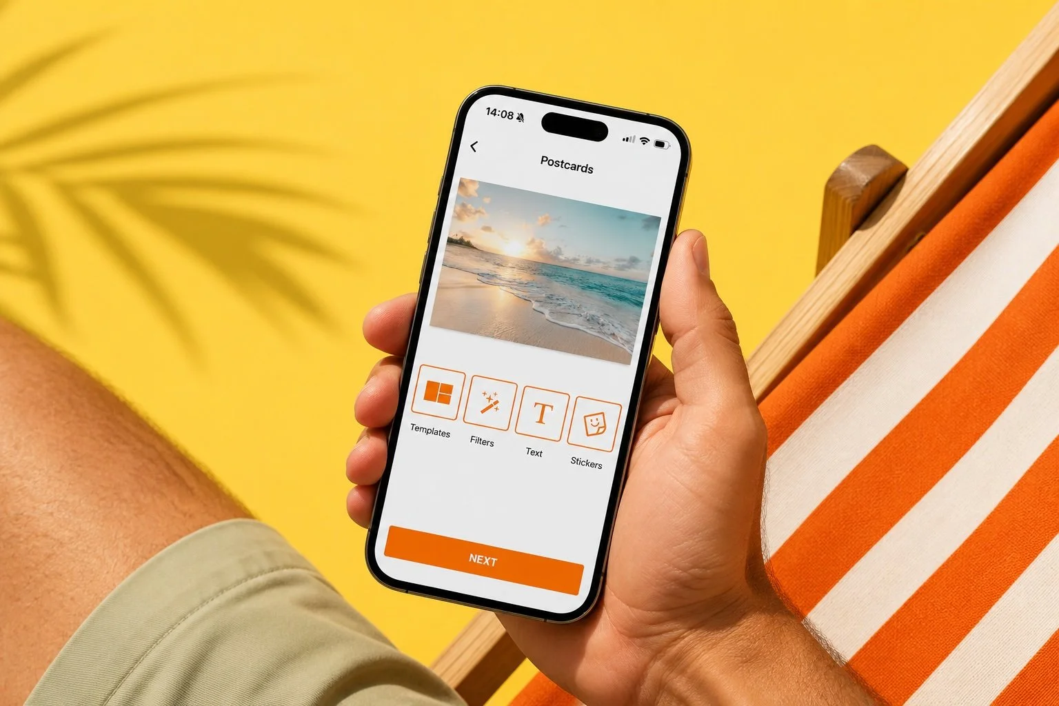
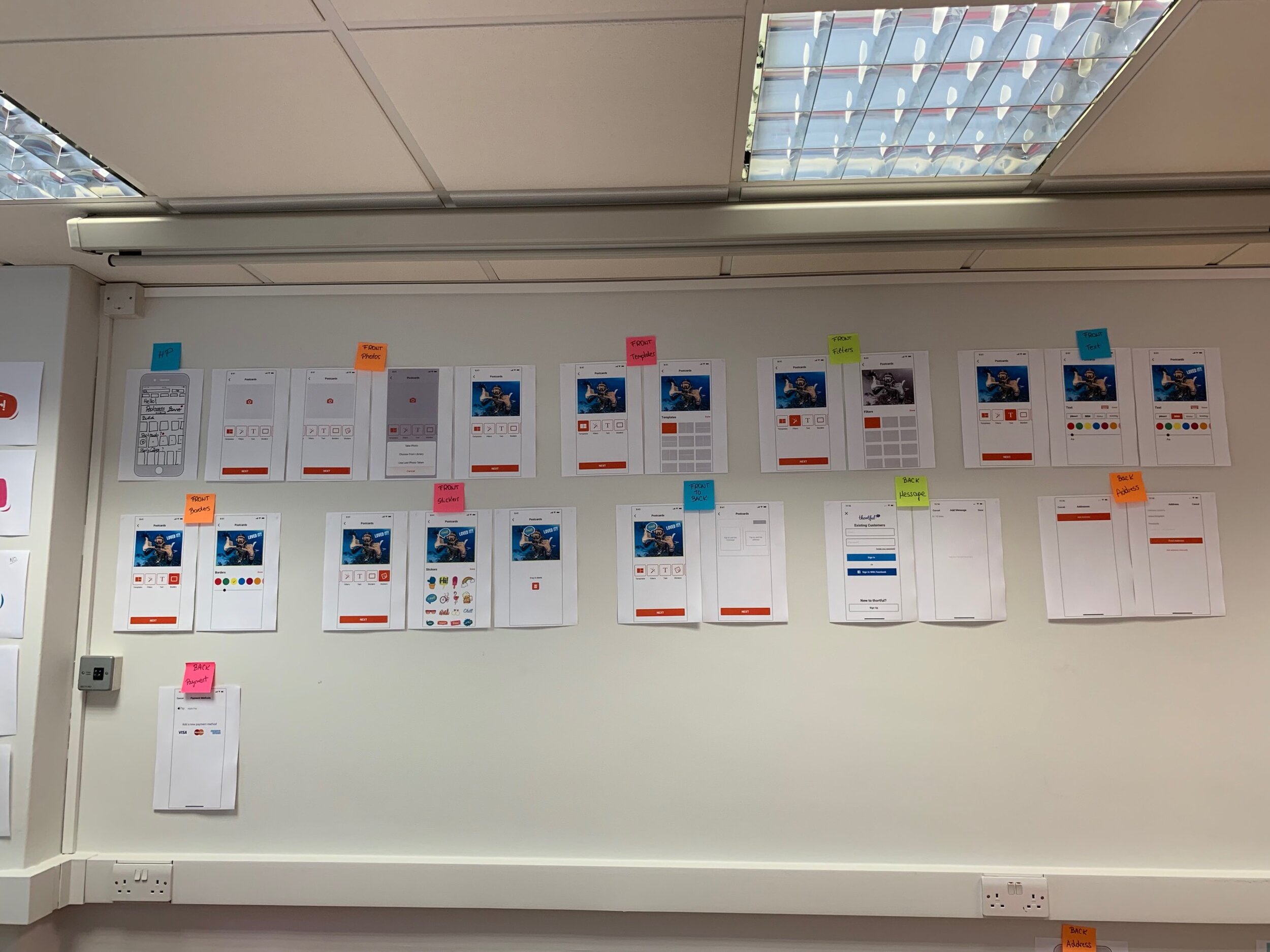
The final MVP flow brought the five principles together into a fast, playful creation experience. Rather than presenting all personalisation options simultaneously, the flow guided users through each layer of customisation in sequence: image, layout, text, embellishments, building a sense of creative progress with every step.
The structure was designed to feel more like building something than filling something in. Each completed step made the postcard feel more personal, which in turn made users more invested in seeing it through to the end.
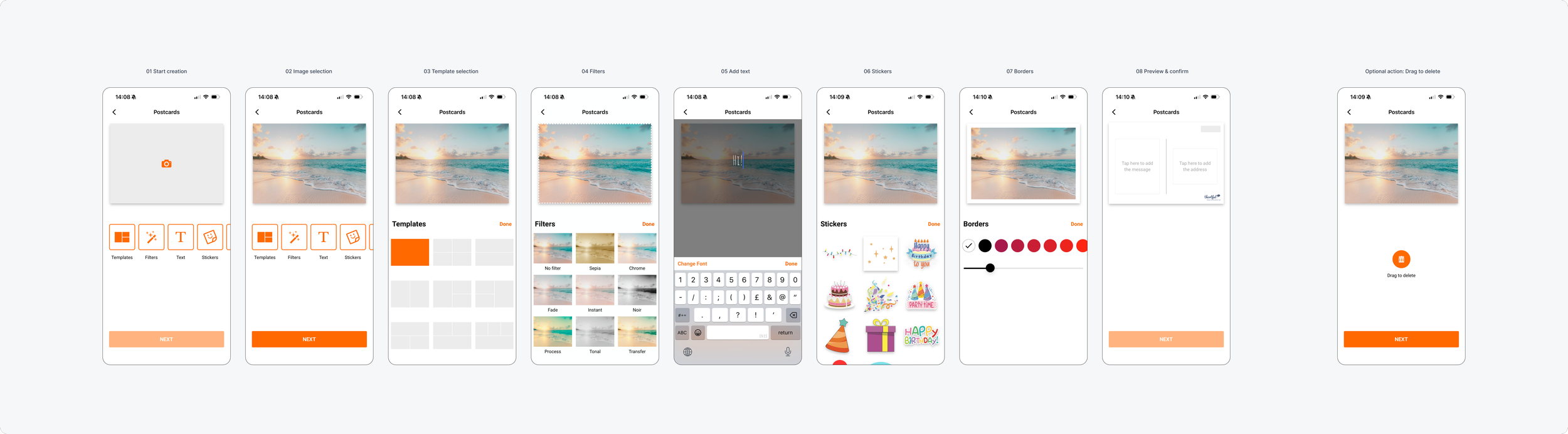
The complete MVP flow from image selection through personalisation to checkout
Where the principles became trade-offs
A 0 to 1 product built to an MVP timeline means every design decision involves trade-offs. These were the most significant choices made during the design process, each one grounded in a principle, each one involving something left out as well as something included.
Image first, not template first: Rather than opening with a template selector, the flow begins with image selection. This was a deliberate choice to establish ownership immediately, a user who has chosen their photo is already committed to the postcard before personalisation even begins.
Progressive disclosure over a full editor: Tools were surfaced step by step rather than presented as a single editing canvas. This reduced cognitive load and kept the creation experience feeling guided, but it also meant accepting that power users might want more simultaneous control than the MVP offered.
Templates as a starting point, not a ceiling: Templates were designed to be overridable rather than locked, providing enough structure to help users start quickly, while allowing full customisation to any user who wanted it. The default state was designed to be good enough to send as is.
Brand alignment as a non-negotiable: Despite the pace of the MVP build, the visual language, tone and interaction quality were held to the same standard as the rest of the Thortful product. Postcards had to feel like a natural extension of the app, not a separate, lower-fidelity feature.
Validating the experience with real users
Before launching more widely, the MVP was tested with real users through hands-on sessions followed by a short survey. The goal was to validate whether the creation flow felt fast, intuitive and enjoyable, and whether the personalisation tools were easy to use without slowing the journey down.
One of the best experiences I've had using the app.
Fast and intuitive.
Very simple and straightforward.
Very quick and easy to use. I really liked it.
Simple and great fun.
Easy, intuitive and creative.
These features are very easy to use and the result is really great!
Awesome and really enjoyable.
Shipped, tested, and built upon
The postcards feature launched as a new product, allowing the team to observe real-world usage, gather feedback and iterate based on how customers used the experience in practice. The testing results gave the team confidence that the core design decisions were sound and that the MVP was ready for the market.
Strong user validation at launch: Over 85% of test participants rated the experience 5 out of 5, with no significant usability issues identified in the creation flow or personalisation tools.
A scalable pattern for new product types: The process and principles established here provided a clear, reusable foundation for introducing subsequent product types to the catalogue, reducing the design effort required for each new format.
Direct path to Photocards: The patterns, principles and learnings from Postcards directly informed the development of Photocards, which went on to become another successful addition to Thortful's catalogue.
Confirmed the progressive disclosure approach: Real-world usage validated that introducing personalisation tools step by step, rather than all at once, kept cognitive load low without reducing engagement or creative expression.
What building from scratch teaches you
Designing a 0 to 1 product within a fast-moving company is a different discipline from iterating on something that already exists. There is no behaviour data, no prior art within the product to learn from, and no safety net of an existing mental model to build on. Every structural decision has to be justified from first principles.
The most important lesson from this project was about the power of sequencing over selection. The personalisation tools themselves were not exceptional, image selection, text, borders, stickers, filters are standard creative tools. What made the experience feel right was the order in which they appeared and the sense of momentum they created together. Users did not describe the tools. They described how the experience felt. That distinction matters.
“Users did not describe the features. They described how the experience felt. That's the right outcome.”
It also reinforced how much co-design and early exploration are worth. The sketching sessions that happened before a single screen was designed saved significant time downstream by surfacing structural questions early, when they were cheap to answer.