Scaling
multi-card
checkout
I redesigned Thortful’s checkout to support one order with many cards, recipients and addresses, making a complex gifting journey feel simple, predictable and scalable.

Thortful is a greeting card marketplace where customers often buy multiple cards in a single order, each sent to a different recipient, address and delivery date. As the business scaled, this complexity began to break the checkout experience. Users lost track of who was receiving what, support tickets increased and conversion suffered. I led the end to end redesign of the basket and checkout across web and mobile, creating a guided system that made complex gifting feel simple while establishing a scalable foundation for future product growth.
A card marketplace built for complexity from day one
Thortful's core value proposition goes beyond buying a single card and sending it to a single address. From early on, the business was built around sending cards at scale: buying multiple cards in one order and delivering them to different people, at different addresses, often for different occasions and on different dates.
When I joined Thortful, the company was growing quickly. As this growth accelerated, new customer behaviours began to emerge. Although the existing basket and checkout had been designed to support multi-card and multi-address orders, it became clear that users were struggling with specific steps in the journey as order complexity increased.
These issues surfaced most clearly through Customer Support. Customers regularly became confused when managing multiple recipients, different delivery addresses, and delivery dates. For a greeting card marketplace built around complex multi-card orders, this was a significant risk to conversion, customer trust, and the ability to scale the product offering over time.
One order, many cards, many recipients, each card potentially going to a different address on a different date. Complexity was baked into the core product from the start.
Calendars, address assignment, and understanding which card was going where were frequent points of confusion as order size increased.
The basket was the most critical part of the product. If users couldn't complete their purchase here, no amount of quality elsewhere in the experience would save conversion.
Not a standard e-commerce problem
Designing this checkout was fundamentally different from a standard e-commerce flow. Most checkouts are built around a simple mental model: one order, one delivery address, one delivery date. Thortful's model broke that assumption from the start.
- ✕ One order, one address, one delivery date
- ✕ Linear flow from basket to payment
- ✕ A small number of decisions to make
- ✕ Users only need to track one recipient
- ✓ Multiple cards, recipients, addresses and delivery dates in one order, each card is an independent delivery
- ✓ Delivery decisions repeat per card, the journey is non-linear
- ✓ Complex mental load, users must track who gets what, when and where
- ✓ Mistakes only discovered after checkout, leading to costly errors
The challenge was clear: design a checkout capable of handling highly complex multi-card, multi-address orders, while making the experience feel simple, predictable and safe.
Where users kept getting stuck
As order complexity increased, the same issues began surfacing repeatedly through Customer Support tickets and direct conversations with customers. To understand these more deeply, I worked closely with the Customer Support team while also running user testing and observational research, inviting customers into the office and sitting next to them as they completed real purchase sessions.
- → Observational research, customers invited into the office to complete real purchase sessions while being observed
- → Customer Support analysis, close collaboration with the CS team to identify recurring patterns in multi card orders
- → User testing, structured sessions to observe how users managed complex orders involving multiple recipients and delivery dates
Even confident users hesitated, backtracked, and second guessed themselves when assigning addresses and delivery dates. The mental effort required to keep track of several cards at once was simply too high.
The problem was not a lack of flexibility, it was a lack of clarity and reassurance.

User observation and collaborative workshops helped surface where users were losing confidence during complex checkout flows
What users kept telling us
I kept losing track of which card was going to which person. Once you have more than two or three, it gets really confusing.
I wasn't sure when each card would arrive. Some cards were for different occasions, so I needed them to arrive on different days, I just didn't feel confident it was set up right.
I only realised I'd sent a card to the wrong address after it was already dispatched. I wish there had been a clearer summary before I paid.
I noticed a "Don't open until" option but wasn't sure what it did or when I was supposed to use it. I ended up ignoring it and hoping for the best.
What that looked like in practice
This is Emma. She's organised, thoughtful, and buys cards for everyone. She's exactly the kind of customer Thortful was built for. And she was exactly the kind of customer the checkout was failing.
Five birthdays. One order.
Emma realises she has five birthdays coming up in March. Mum, two friends, her boss, and a cousin in Madrid. She opens Thortful and finds the perfect card for each of them.
She heads to checkout.
Five cards, five recipients, five addresses, five delivery dates, she needs each one to arrive on a specific day. She starts the checkout flow, confident it'll be straightforward.
Wait, which card is this for?
The checkout asks her to assign each card to a recipient. But the cards all look the same in the list. She starts to second guess herself. Is she assigning the birthday card to her mum, or to her boss?
She enters the addresses. Probably.
She enters five addresses one by one, but there's no clear confirmation of which address belongs to which card. She scrolls up and down trying to check. She thinks it looks right. She hopes it looks right.
Her mum's card goes to her boss.
Two days later, her mum calls. The card hasn't arrived. Her boss mentions receiving something unexpected. Emma had swapped two addresses in the checkout and had no way of knowing. The order is already dispatched.
She contacts support.
Emma contacts Thortful's Customer Support team to try to fix the delivery. The team has to intervene manually, a process that takes time, wastes resource, and leaves Emma frustrated with an experience she thought would be simple.
The Experience Mapped
| Stage | View Basket | Set Delivery | Add Address | Choose Date | Review & Pay |
|---|---|---|---|---|---|
| Actions | Reviews cards in basket, checks quantities | Tries to assign recipient per card | Enters addresses for each recipient | Attempts to set different dates per card | Looks for a summary before paying |
| Thoughts | "This looks straightforward" | "Wait, which card is this for?" | "I can't tell if I'm adding this to the right card" | "I'm not sure if these dates will be right" | "I just have to hope this is all correct" |
| Emotions |
Calm, in control
|
Slightly uncertain
|
Confused, losing track
|
Anxious, second-guessing
|
Nervous, low confidence
|
| Pain Points | — | No persistent label linking each card to its recipient | Unclear which address was assigned to which card | Dates repeated across cards with no per-card structure | No clear pre-payment summary of who gets what and when |
Not Simpler. Clearer
Research made one thing clear: users weren't struggling because the checkout asked too much of them. They were struggling because it gave them too little to hold on to. No persistent labels, no per card structure, no clear summary before paying. The problem wasn't complexity, it was the absence of clarity and reassurance.
That reframed the goal entirely. The answer wasn't to reduce what users could do. It was to make sure they always knew what they were doing.
Feel confident at every step, always knowing which card is going to which person, at which address, on which date. No second guessing, no backtracking, no mistakes discovered after dispatch.
Reduce the volume of delivery related CS queries caused by checkout confusion, and give Thortful a checkout foundation that could scale as order complexity and the card catalogue grew.
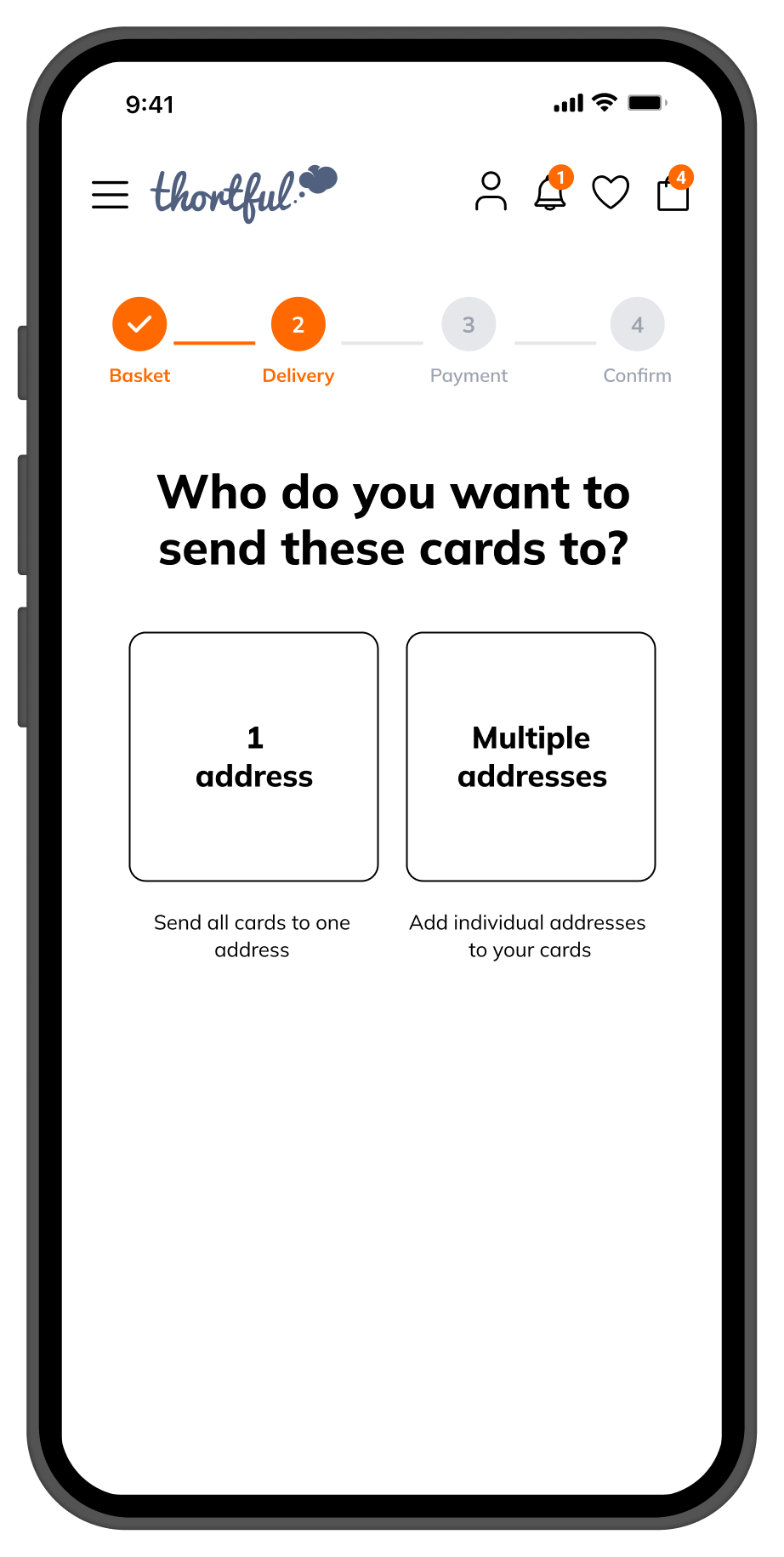
One flexible checkout structure that worked for any order size, from a single card to twelve, without requiring separate flows or breaking as new products were introduced.
Designing for the hardest case first
The basket and checkout needed to support a wide range of order scenarios from the very start. Customers could be new or returning, buying for themselves or others, sending a single card or many, each potentially going to a different recipient, address and date.
For the purpose of this case study, I am focusing on the most complex scenario we designed for: a single customer buying multiple cards and gifts in one order, each sent to a different recipient, at different addresses, and scheduled for different delivery dates.
This scenario brought all the underlying challenges together in one journey. By solving this scenario well, we ensured the basket and checkout system could comfortably support every simpler use case. If the experience worked clearly and confidently here, it would scale naturally across all other order scenarios.
Manchester, M14 2QT
United Kingdom
London, W2 4BR
United Kingdom
Edinburgh, EH1 3QL
United Kingdom
Bristol, BS1 4RP
United Kingdom
28013 Madrid
España
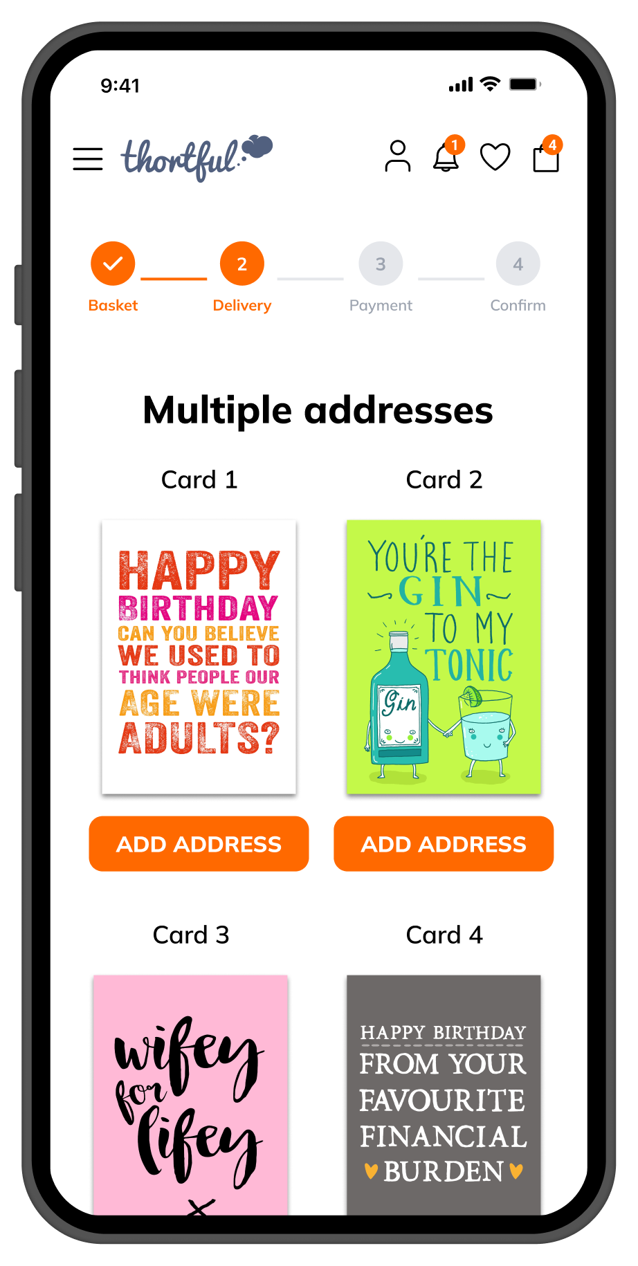
The focus scenario — one order, five recipients, five addresses, five delivery dates. Each card is an independent delivery decision.
Although the overall flow appears linear, delivery decisions actually repeat per card. For a 5 card order, the user makes 20+ individual decisions. The design had to make this feel like a natural, manageable sequence, not a chore.
By making each card the primary unit of the checkout, users focused on one recipient at a time. This reduced cognitive load and prevented the confusion of managing multiple cards simultaneously.
The full order remained visible throughout every step. Users could always see what had been completed and what still needed attention, preventing them from losing context as the order grew.
The same structure worked for one card or fifteen. Rather than designing separate flows for simple and complex orders, one flexible system handled both, keeping the experience consistent at any scale.
Although the flow appears linear, delivery decisions repeat per card — the design challenge was making this feel simple regardless of order size
How We Made Complexity Feel Manageable
The core design decisions that shaped the final experience each traced directly back to the research and the principles. Every choice was made to reduce cognitive load without reducing flexibility.
Clarity Over Flexibility
Flexibility was essential, but never at the cost of understanding. Users needed to clearly see which card was going to which person, address, and delivery date at every step of the journey.
One Decision At A Time
The flow was designed to reduce cognitive load by guiding users through decisions sequentially, rather than asking them to manage multiple variables at once.
Make Complexity Feel Simple
While the underlying system was complex, the experience had to feel predictable and easy to follow. The goal was not to remove complexity, but to hide it behind a clear and structured flow.
The Basket Must Never Be The Blocker
No matter how good the rest of the experience was, users had to be able to complete their purchase with confidence. The basket and checkout could not be the point where users dropped off.
Confidence Over Speed
Moving fast only mattered if users felt sure they were doing the right thing. The experience prioritised reassurance and clarity so users could proceed without second guessing themselves.
How Those Principles Shaped The Design
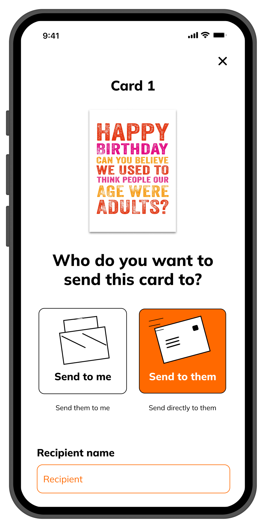
Card By Card Structure
Delivery decisions were handled one card at a time, so users focused on a single recipient at a time rather than juggling the entire order at once.
Persistent Order Overview
The full order remained visible throughout, so users always knew what had been completed and what still needed attention, preventing loss of context as orders grew.
Clear Recipient Labelling
Each card was clearly associated with its recipient throughout the flow eliminating the confusion of which card was going where.
Surfaced "Don't Open Until" At The Right Moment
The card label was introduced clearly in context so users understood when and why to use it.
One Scalable System
Rather than separate flows for simple and complex orders, a single flexible structure that worked for both keeping the experience consistent and maintainable as the product grew.
One Flexible System For Every Order Scenario
Rather than designing separate flows for simple and complex orders, I focused on creating one flexible system that could scale effortlessly. The checkout was structured around cards as the primary unit. Delivery decisions recipient, address, delivery date and card intent were handled per card, allowing these steps to repeat where needed without breaking the overall journey.
Throughout the journey, the full order remained visible, allowing users to understand what had already been completed and what still needed attention. This helped prevent users from losing track of who each card was for, even as the number of items increased.
1. Checkout Flow Overview
A high-level view of the end-to-end checkout structure, showing how delivery steps repeat per card while the overall journey remains coherent.
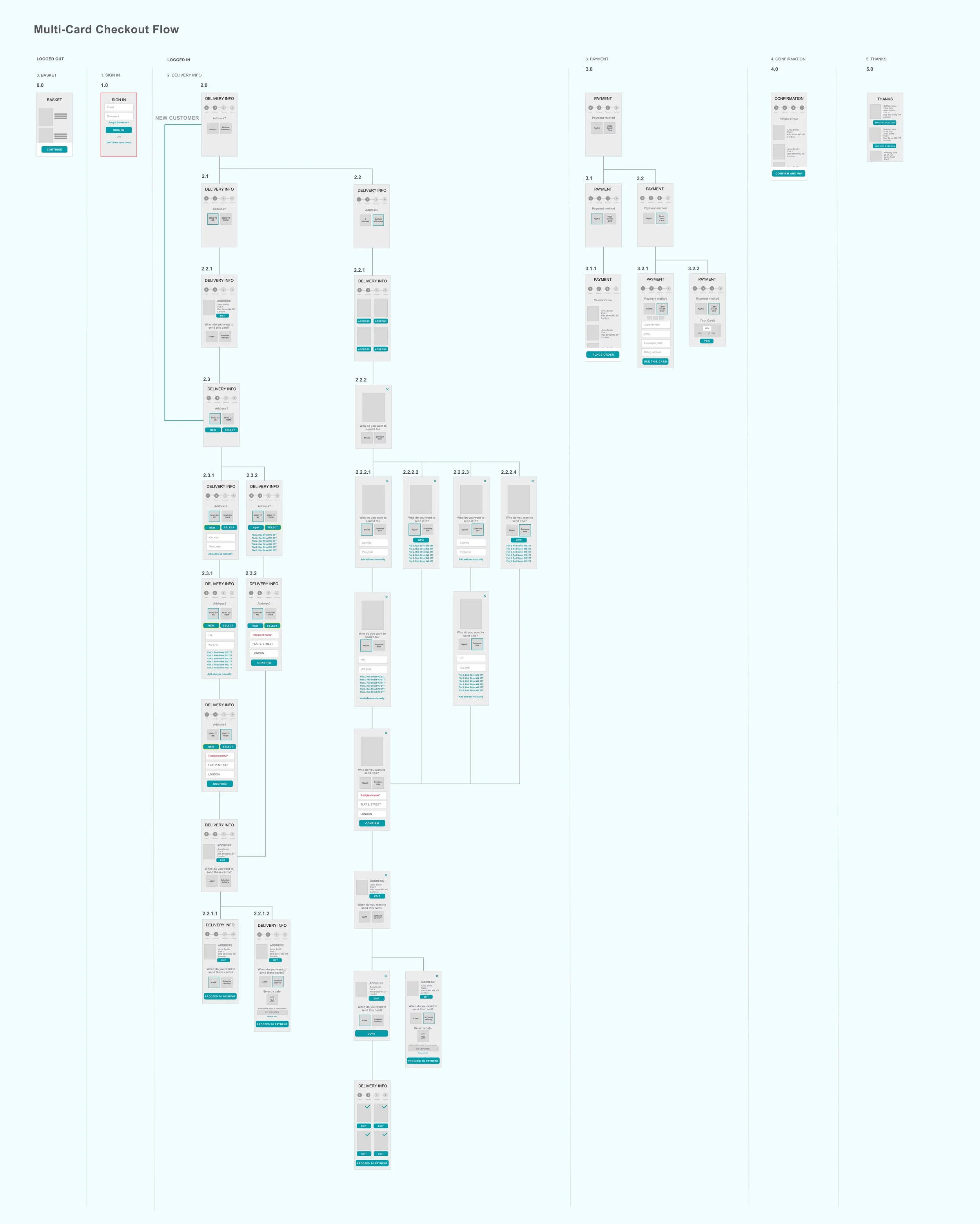
End-to-end checkout structure delivery steps repeat per card within a single coherent journey
2. Wireframes Low & High Fidelity
Early low and high fidelity wireframes used to explore layout, hierarchy and interaction patterns before moving into final UI design.
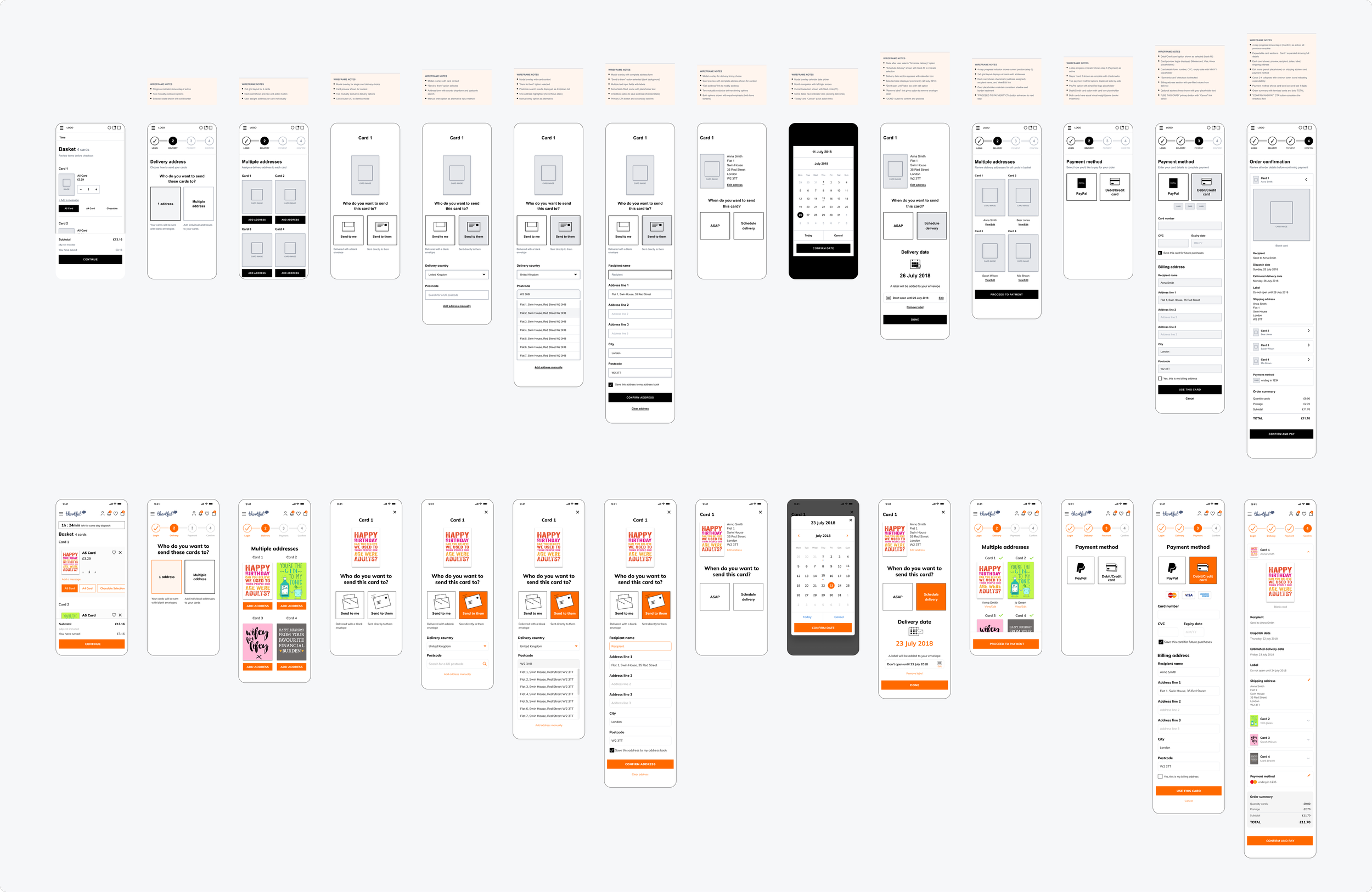
Wireframes exploring layout, hierarchy and interaction patterns from lo-fi to hi-fi
3. Multi-Card Checkout Flow Complex Scenario
A detailed flow illustrating how the system scales when a single customer sends multiple cards to different recipients, addresses and delivery dates.
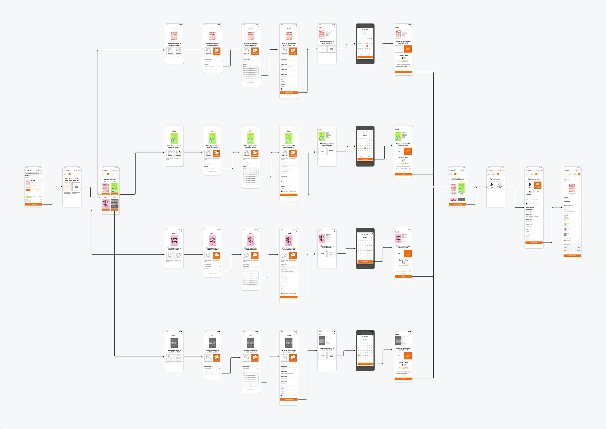
Detailed flow for the complex scenario multiple cards, recipients, addresses and delivery dates in one order
4. Key Screens – The Final Experience
Six screens showing the most critical moments in the checkout journey, from basket review through to order confirmation.
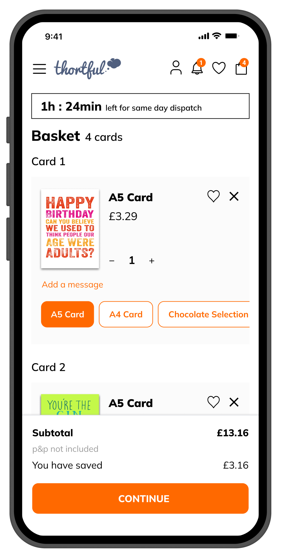
& quantities
or send to them
address overview
address details
method
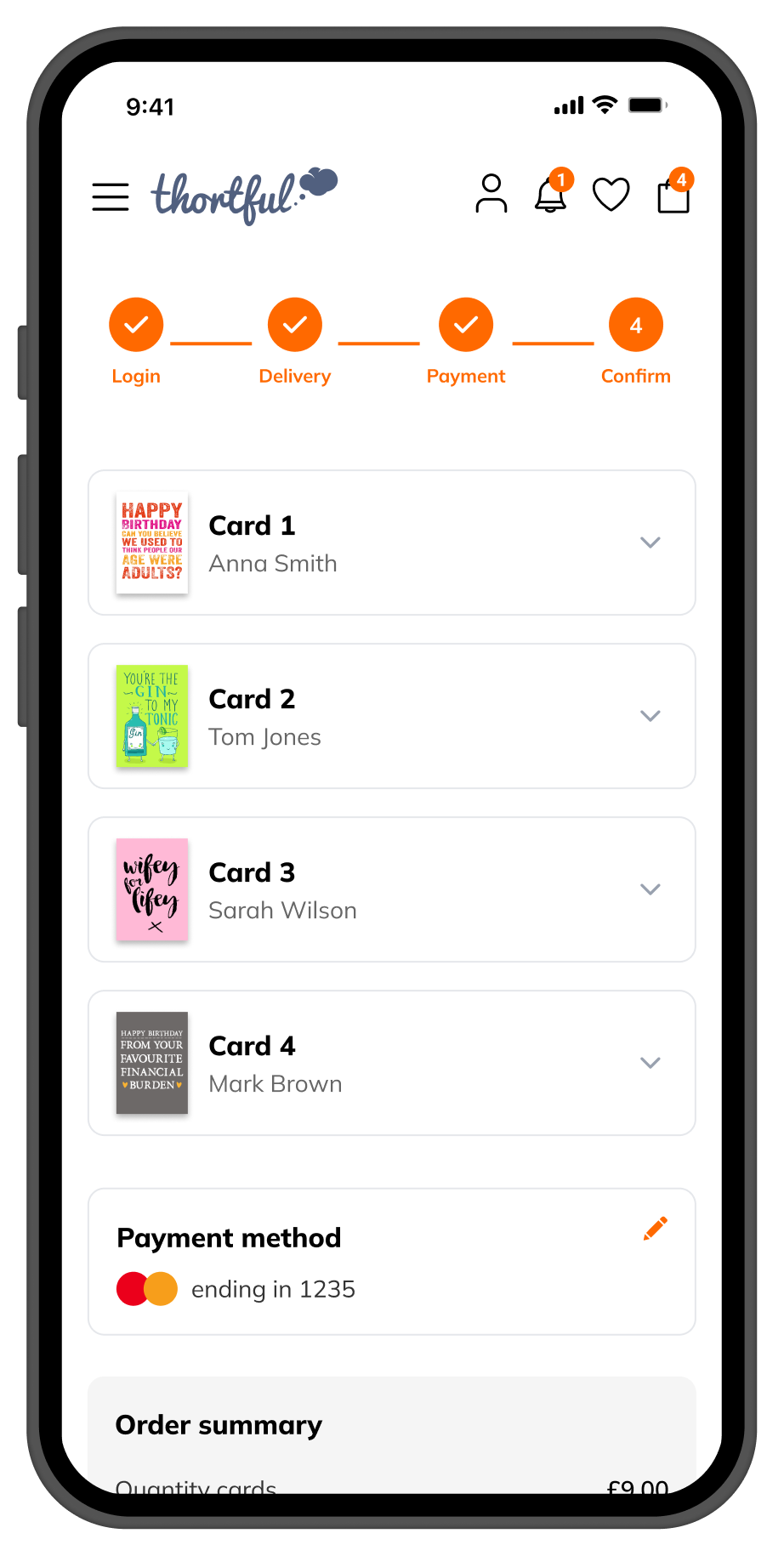
confirmation
The full checkout journey basket to confirmation each card handled as an independent delivery
& quantities
or send to them
address overview
address details
method
confirmation
Complex Card Orders Made To Feel Effortless
The redesigned basket and checkout made complex multi-card orders feel clear, calm and confident. Users were able to move through the checkout smoothly, even when sending multiple cards to different recipients on different dates.
Clearer Checkout, Fewer Errors, Happier Customers
By structuring the experience around one card at a time, while keeping the full order visible throughout, the checkout became easier to follow and more predictable, allowing users to focus on choosing and sending their cards without second-guessing delivery details or their progress through the flow.
-
Checkout conversion increased significantly: The redesigned flow removed the friction that had been causing users to abandon their orders mid-way through complex multi-card purchases.
-
Complaints related to delivery options were largely eliminated: The clearer structure around addresses, delivery dates and "Don't open until" removed the most persistent sources of user confusion.
-
Substantial reduction in delivery-related Customer Support queries: The improved clarity around delivery assignment meant fewer post-purchase errors and less manual Customer Support intervention.
-
A scalable foundation for future growth: The card-by-card structure and single flexible checkout system provided a robust base for Thortful to expand its card catalogue and support new ordering scenarios.
What This Project Taught Me About Designing For Complexity
This was one of the most system level design challenges I worked on at Thortful. It taught me that the best way to handle complexity is not to hide it but to sequence it. Users do not struggle with complex purchases. They struggle when the interface asks them to think about too many things at once. Breaking decisions into a clear repeatable sequence solved the problem without reducing flexibility.
It also reinforced that checkout design is a systems problem, not just a screen problem. Every decision about structure, hierarchy and flow had downstream consequences for Customer Support conversion and the business ability to scale. Getting it right required thinking beyond the interface and understanding the full operational impact.
Sequence Complexity, Don’t Hide It
Presenting decisions one at a time rather than all at once dramatically reduced cognitive load. Users could handle complexity when it was structured. They could not when it was dumped on them.
Confidence Is A Design Outcome
Speed clarity and aesthetics all mattered but the metric that actually predicted whether someone completed their purchase was whether they felt sure about what they were doing. Designing for that feeling changed everything.
Design For The Hardest Case First
By solving the most complex scenario many cards many recipients and many delivery dates every simpler use case scaled naturally. The opposite approach would have meant patching the system endlessly as complexity grew.
Part Of A Product Users Kept Coming Back To
This work was part of a broader effort to improve clarity, usability and trust across the Thortful product. Together with many other features and improvements, it contributed to Thortful being featured as App of the Day in 2019 and 2020.
In the years that followed, the app continued to receive consistently strong user feedback, reflected in a 4.9 out of 5 App Store rating.
App of the Day, 2019 & 2020
Thortful was featured as App of the Day across both years as part of a continued effort to improve the quality, usability and trust of the card marketplace experience.
What Users Said
This app is always my go to for cards. You can find exactly what you need and order in minutes.
Everything is clear and effortless to use. The app makes the whole process feel quick, simple and stress free.
Great service, easy to navigate, excellent choice of cards sent directly to the recipient.
Card sorted and sent in no time.
Love this app, so convenient and easy to use. My new go to for all occasions.
Ordering cards for multiple people has never been this simple. Arrived on time, every time.